Quote:
I think I would have to make the frames transparent in order to make it actually match though. |
Quote:
A few of the places pixel fonts excel in are: (Must have MONOCHROME mod to look its best with shadow set to (0, 0)
|
3 Attachment(s)
Well... here it is xD unit frames go~ looks kinda odd to me still :P
There is a border though behind the UF's, the shadowy border at least as seen in Image2 when I have threat. Also, 3rd Image shows party frames. And ops, apparently something happened to my threat~ Dps bars z.z gotta look at it. Quote:
--Example of my quest text is in image3 below. I am using a mixture of Swfit and Supernat1001 for my fonts, swfit for UnitFrames, and data text, and supernat for like quest text, my exp bar minimap and some other things. Pixel fonts have a lot of varieties and uses :o |
Quote:
|
Here is my a WIP:
 |
Quote:
|
I have the following mods
Archy Grid Prat Move Anything Bartender 4 Bagnon Doom Cooldown Pulse Lose Control Nug ComboBar TidyPlates OmniCC Skada Power Auras Iinterupptedthat KGPanels Button Façade (or whatever replaced it) The background I made specifically for my rogue (although my DK uses it as well) The paladin has different artwork which I might submit at a later time. The artwork has elements from the Diablo III Official Website, Rothui (map background) and hacked up bits from several images from a wonderful interface artist known by Hunqwert on deviantart.   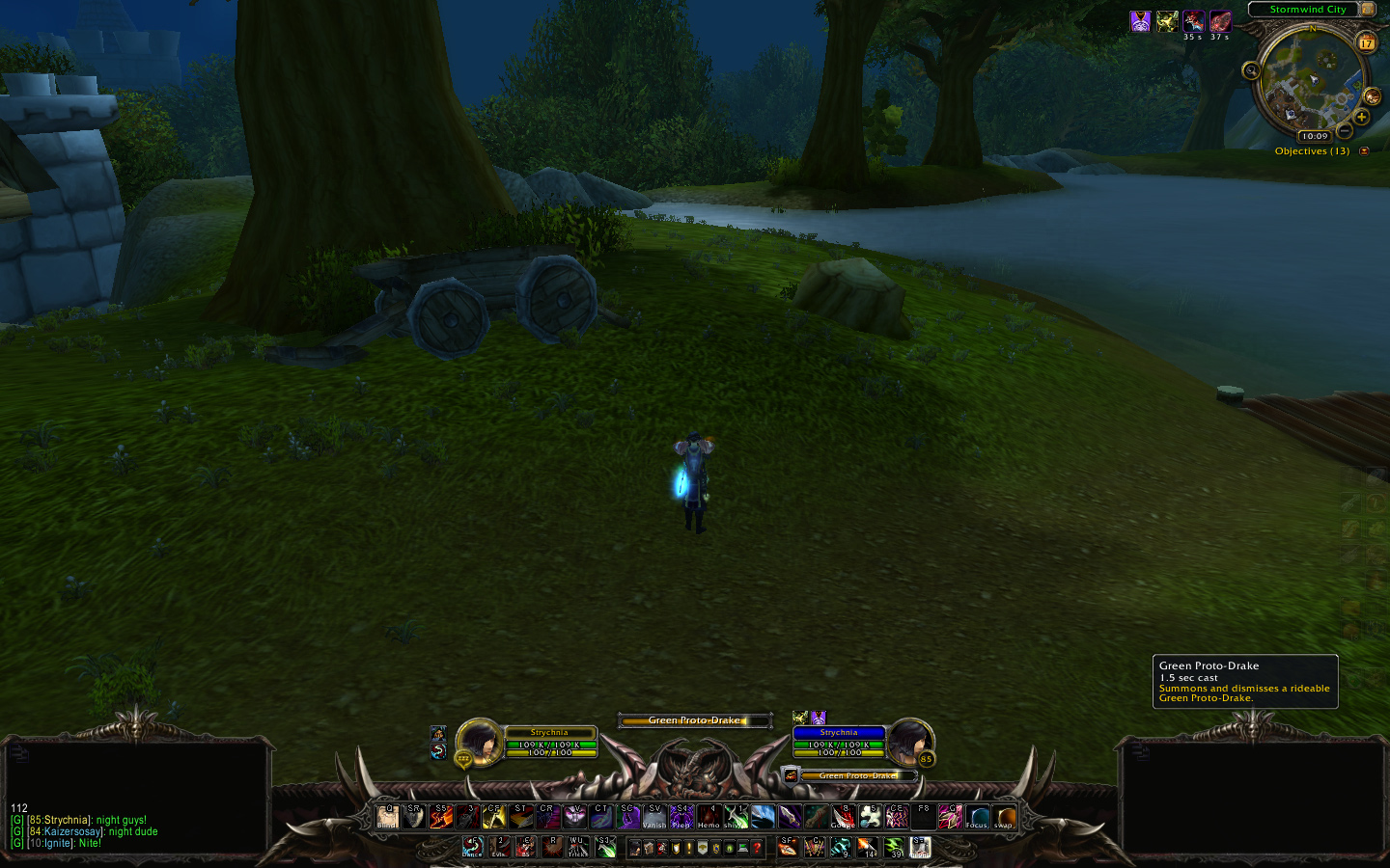 |
The artwork is really well done, though I simply can not stand those standard UFs... looks terrible and ruins all the great work you put into it.
The minimap is the other spot I would change... (Nearly) standard map doesn't fit the rest of the (changed) stuff... |
Quote:
Good point about the map not fitting, I will be making a new one today Thanks for the comments and advice ;) |
Check out oUF and the great layout by zork, it may be a starting point.
I guess you have already messed with Blizz-Lua, so oUF should provide you a sufficient framework to create "fitting" unitframes. |
Quote:
|
1 Attachment(s)
Not quite sure what to do with my Skada and DBM. Any suggestions?
|
Quote:
Quote:
Quote:
|
1 Attachment(s)
Quote:
Just place it here after joining a party though. |
My new one...digging it pretty much so far.
 showing tooltip and target buff/debuffs  |
Quote:
|
Quote:
|
Quote:
|
Quote:
|
In my continuing effort to learn putting together a UI, this is my latest offspring.
Not reinventing the wheel. Merely taking a square piece of metal and hitting it until it sorta looks round-ish.  |
| All times are GMT -6. The time now is 07:34 PM. |
vBulletin © 2024, Jelsoft Enterprises Ltd
© 2004 - 2022 MMOUI