any graphic artists?
So.... as we move closer to carbonite2 (when 5.2 launches there will be an alert popping up that carbonite is entering retirement). Any graphically minded folks able to create a new logo? :D
|
What did you have in mind? Maybe some of can link a few here in this thread, vote on the ones you like (if its not a clear cut choice that is :cool:)
|
that's the problem :P I don't really have any idea's in mind lol .... I liked the original graphic they used, and had thought of just sticking a big red 2 over it... but then thought i'd ask since there are a lot of very creative people around
|
What are the orginal gfx you are talking about? Post a screenshot please. I may be able to provide something. So you have sth to choose from.
|
Quote:
 |
Ok we know design is free reign, how about size? Got any restraints? Same size, bigger, smaller, diffrent shape :D?
|
1 Attachment(s)
I sat down and did you a logo in 1024x512.
The following thumbs show the logo. First one is a PNG with transparency. Second one is the alpha layer by itself. Third one the the image layer by itself.    I will add the TGA file in the post as a zip download. Hope you like it. |
VERY nice!!!
I like image's 2 and 3 with the shadows, but I like the colouring of image 1.... Maybe make the shadows more prominent? (I know image 1 is the finished product and 2&3 are the layers) Also, What would the image look like if the II was behind the Carbonite logo and maybe slightly bigger? I'm not GFX minded so this is just feedback.. Positive feedback I hope :) *edit Nevermind what I said about the shadows... I clicked image 1 and saw it on a transparent background. The shadows don't show in your thumbs..... 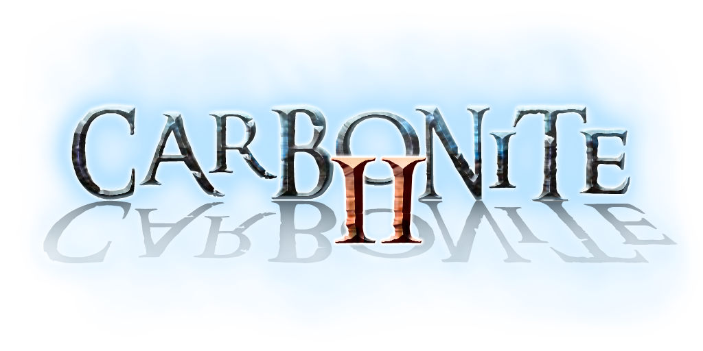 ^using the [img] tags |
1 Attachment(s)
Threw these together last night, before the internet went down :mad:
First one  second one  a little error in the first one i notice, but at work now and cant fix it atm. Looking for pointers and/or criticism. Other than that y'all like this direction or should I try another way? |
WOW! we have some very talented people here on the forums...
I like the Font of the second image, but I feel the 2 is a bit out of place? stretched? IDK I can't place my finger on it... Maybe a II would be better? Or a colour change of the 2? The first image is awesome and I can't see the mistake you have mentioned... (untrained eyes lol) Looks like Rythal will have his work cut out for him (again) to decide what one to pick lol. Both contestants (so far) have talent and I hope there is more entries so Rythal Literately can't choose lol :p |
@zork Liking the reflection method, and the "II" seems to fit better than my "2" I stuck on mine.
@JimJoBlue Yea I did distort the "2" a little much in the second one. Thanks for the feedback/suggestion about the "II", I'll give that a try this afternoon |
I'm looking forward to it!
Keep them coming!!! :banana::banana::banana::banana::banana::banana::banana::banana::banana::banana: |
Wow... yeah both look great! I wish I had talent to do stuff like that, but I guess we all have our own areas of expertise!
|
Quote:
|
 |
@Cirax I like that one, although, the glow in the middle kinda leaves the ends a bit lacking. Maybe tone the glow a bit or make the text pop a bit more?
|
1 Attachment(s)
The electricity background is 1 premade object that I did not create but felt it would be a good thing to use. The text itself I was trying to get an electricy feel to it and have the colors sort of blend in with the background image. I'm not too sure how to make the text pop so much without separating the similarities.
Edit: I added the psd to my post if you want to toy with it, I'm still biased to my version. :P |
Personally I would layermask the first 2 and last 2 letters (just the letters not the "static" attached to them)and maybe adjust the levels just so they dont look like they fall in the back ground. Right now "bonite" looks fine but starts to fall off on the other letters. Dont get me wrong I think it looks great, and these are just my opinion, just tossing ideas at ya :cool:
Quote:
|
Decided to add a simple gradient overlay..
 |
Very nice:banana:
|
2 Attachment(s)
How about......
Attachment 7596 I know it should be blatantly obvious to you guys, but all I did was add a layer under the text that was four pixels larger and filled it with black. Just separates the text from the effects. Here's the file if you want it. Attachment 7597 |
Having a border that thick separates the text to the extent that the "electricy" addition to the text is completely negated which is what I was trying to point out in my initial reply.
|
2 Attachment(s)
Well, you could always fade the border so that it is not as intrusive, but it's still there separating the text so that it doesn't get so lost in the effects. IE:
Attachment 7599 The outline layer has been faded to 35%, so it's still there, just not quite as intrusive. Anyway, not so exciting, but, here's my entry: Attachment 7598 |
If you want the text to stick out slightly more than my previous image with the gradient overlay here's a 60% drop shadow added to it.
 added 1 with the background color matching wowinterface in the event you were to add it to the addon information page.  |
Quote:
|
Quote:
{slams head on table} GAD!! I'm such a hack at this stuff. :o |
Quote:
|
Added another image to my previous post. :P
|
In honor of Carbonite getting a new life. I give you the proof :cool:
 |
Stop stealing my wind effects :P I like the idea of giving it a life line but, too much purple for my taste.
|
Yea kinda is for me to, heinsight is a bitch :P. colors can be changed though, so im up for ideas
less purple one :P  |
The colors are better indeed. However, the font I'm not too sure it works out for the life line. It acts as if half the word are block letters with their close tracing of the border whereas the ARB and even the O to an extent don't really stand out with the rest. I think it just might be the font choice for the style but, if you go with a more scripty font it may be harder to read.
|
Quote:
Ingame textures in WoW are based on TGA files (most commonly converted into a BLP file). TGA files consist of 2 layers. Image and alpha layer. The alpha layer provides areas in 8bit (black/white) that define the image transparency regions. The image layer is in 24bit color. The game uses the alpha layer to hide areas on the image layer. So the result is in fact the transparent png. Thus the image will work on any background. As it can be seen here.  Btw..have you thought of doing sth that actually has sth to do with Carbonite? To do that I would gather some Carbonite keywords.
Based on those I would create a logo. The elictricity image may look cool but it has nothing in common with the product behind it. Think of the new Google Maps logo.  The logo has crincles making it look like a map. It has the iconic red marker and some lines in the background to stand as a freference for the famous Google maps map display. Additionally we have the Google "g". Being a masterpiece it even references all Google colors. (green, blue, red, yellow) I'm no Carbonite expert but you probably are. So think of keywords that you can relate Carbonite to and use common symbols referencing those keywords. The original Carbonite logo is referencing Lord of the Rings because it is using the LotR theme font. That being said it is a reference to the fantasy genre in general which WoW is part of. |
2 Attachment(s)
A couple quickies. One logo; two different colors.
I kept the design simple, so that it may be more versatile. Easily legible at larger or smaller resizing, if necessary. I chose to use the numeral "2" instead of the "II" to avoid a possible confusion with "version 11". heh heh |
3 Attachment(s)
I had a last minute thought. Carbonite is also the name of another company which has nothing to do with this World of Warcraft addon, so I added a line of text to differentiate the two.
-------------- EDITED 9:00am (pacific time): I guess I have too much time on my hands. For the sake of novelty, I added a Windows Movie (.wmv) file of the logo. (It's zipped). :) Try not to play it "Full Screen," since it wasn't designed for that. Default size looks better. |
Quote:
|
Quote:
|
Quote:
|
Ok, I have an idea for a new splash. Only 1 thing I need to know first. Is there any rules stating we can or can't use the WoW maps for addon images? Azeroth as a whole for example.
|
as far as I know, nope no rules forbidding that... as for my personal rules... nope none :D i'm really loving and enjoying seeing the idea's you guys come up with.
|
One more question then, how long before you pick one. Only asking because I'm trying to get a rough idea how long i got to come up with more :D
|
Quote:
Reference: First owner of copyright http://en.wikipedia.org/wiki/Copyrig...sion_dichotomy Quote:
|
Quote:
Until it's ready for a general release i'll be keeping it as Carbonite just to keep and maintain the backwards compatability with the current live release if people need to switch back. If i have the cash i'm thinking i'll hold a contest and let everyone vote on the new logo, award a blizzstore pet or something to the creator and to one random person who votes.... been wanting to run some kinda contest for you users anyways as the total # of downloads inches closer and closer to the momentous 10 million mark, so it works to have a good reason to run it :P |
thinking further on it, might try to get some folks to help pick 5 or 10 semi-finalists out of everything created and submitted until that point. If i can talk them into doing it :P
|
OK, IMO, this is kinda rough. Having said that, the more I look at it I like it. But then again I made it so I'm some what bias :D. Tell me what y'all think of this one
 I was trying to get the Map aspect and the recoding aspect to work together |
That's VERY difficult to read.
|
better?
 |
No. :p The background's not the issue. It's the dark green text against the black shadows and kerning on the font.
|
lol fair enough, i didnt really think it would work but it was worth a try. Cant win them all
|
Questions about logo design requirements, etc.
I believe some of the questions have been asked already, but I haven't seen replies to them.
So, here are a few things I'm not clear on, and maybe others need to know these issues, too: * Where will the logo be used primarily? (in-game, websites, banner ads, etc.).Knowing the answers to such questions before the design/creation process begins is of utmost importance. |
1 Attachment(s)
Wow! I never even thought about all of that stuff. I just figured it was for the in-game splash screen.
Speaking of which, here's another dull one for you guys :o : (Picture may be smaller than intended. Original size is 512 x 256. Click the picture for a larger version (if needed).) Attachment 7609 I'm sticking with the "less is more" concept. |
Quote:
QUESTION: Jeffy162, do you know where I could dig into the file system to find that specific graphic (the one being used currently) so that I could examine its properties and use those as a foundation? I don't know where to look. By the way, your graphic is very 'clean' (that's a high compliment!). I think it ranks in the top of all that I've seen, so far. Several of the others are also very well done! But, as the "Highlander" says... "There can be only one!" The ones I made were never finalized, purposely. They are merely quick sketches. I needed something to begin the conversation (which I started in the previous post). heh heh. Submitting a 1920 x 1080 graphic may not be suitable for use as a replacement for the existing one that Rythal wants to replace. The existing, in-game one which moves across the screen with sound, is much smaller (at my monitor's rez), even though I still don't know the exact size of it and which file format it's in. That's what I'm hoping to find out the specifics on before I begin a serious attempt at a design. It takes the same amount of time to create one that won't be suitable as it would to create would that will be suitable! Makes sense to me. I'm still hoping for some answers. |
I'll field the location question. Its in "World of Warcraft\interface\addons\Carbonite\Gfx", the main splash is called "Carbonite.tga", tga being the file format that wow uses for images ingame. Also going to include the dimensions, included channels and resolution of the original file. For the dimensions, the original is 512px (7.111 in) x 256 (3.556 in). 3 channels (RBG color). resolution = 72px/in.
Edit: Oh and just FYI for everybody wanting to make a animated banner, like a gif, you cant for the fact that tga files don't support animation |
2 Attachment(s)
Quote:
EDITED: Isn't 512px X 256px rather large compared to the graphic that now floats across the game screen? These 2 examples look quite blurry at this size. Clicking each one to enlarge them sharpens them up just a little bit. I'm aware that bitmap images scramble when size is altered. I haven't changed my CMYK colors to RGB yet. I forgot to do that! grin. |
WoW textures sizes have to be a multiplicator of 8. So your texture needs a width/height of 16,32,64,128,256,512,1024 is what you have to work with.
But this does not mean your actually logo has to be that big. You can have a 200x100 logo inside a 256x128 texture. |
2 Attachment(s)
Quote:
All of that aside, though, yes, the graphic you want is where mjumnito stated and in the .tga format with no additional transparency (Alpha channel) layer. The original graphic doesn't need one and as far as I can tell none of the others do either. One thing to keep in mind while we are attempting to make a new graphic for Carbonite is that there is, in-game, a black frame that is programmatically put around the graphic along with the Carbonite addon information for whatever version is currently in use in your game. I think that's why black will work so much nicer as a background for the graphic, along with the graphic itself not having any thing contained in (on?) it that appears to "run" off the edges of it. This is my opinion, though, and I know that the frame can be changed around to "fit" any graphic size and color. Well, more correctly, the graphic can be re-sized by the addon to fit whatever size the author decides is appropriate to use so, essentially, the size of the graphic really doesn't matter except for how much memory it takes up, I guess. I did an in-game test on my last graphic to see how it looked and this is the result. I run an addon called "Flourish" and that's the text that is overlaying the bottom of the graphic. Attachment 7612 Attachment 7613 As with everything I post, you might have to click on the picture to get a larger version and, depending on your browser settings, it may open in a new tab or window. Sorry. :o |
Quote:
Essentially the same thing? Sorry, Zork, I know you have a lot more knowledge about this than I do, and math was never my "strong suit" anyway. :) |
2 Attachment(s)
Well, I changed my latest graphic a bit to try something out, and it appears that it doesn't matter, currently, if there is any transparency in the Carbonite logo graphic.
Attachment 7614 It may not be obvious, but most of it is transparent with only an "oval" of black behind the logo with the rest of it being transparent. When I click on the image for the larger view, the transparent part turns white, so if that is what you see, that's why. The uploaded image is a .png that is 512 x 256. No screen shot since it looks exactly like the previous one in-game. I have another version I was going to try, also, but I think I'll wait for that one (or, more likely, not at all). Attachment 7615 This one is black with the same oval behind the logo being transparent. It's even less obvious than the other one. |
Quote:
A good example of what I'm saying is viewing your attachments on this forum page. This forum's topics page uses a "background" color which is not quite black (0,0,0) and one of your images display that fact. Am I right, or am I still misunderstanding you? Sorry. If users cannot output/convert images to ".BLP" hopefully, you or someone else can do that. |
Quote:
I would say primary background should be black as jeffy pointed out the ingame display currently counts on that. It can be any format, tho as mentioned above it's final for ingame will be TGA No Textual requirements No animation, since the ingame engine can't use it. In general i'm giving free reign on colours / text / style ... Carbonite2 will be a new beginning, so i'm not relying on anything from old. |
| All times are GMT -6. The time now is 07:48 AM. |
vBulletin © 2024, Jelsoft Enterprises Ltd
© 2004 - 2022 MMOUI