I'm not one of the minimalist people. Yes, I like it simplistic and stripped, in a way, but I still want my UI to look "robust", so to speak. This is where this inspiration has led me so far. What do you guys think? Speech is free :)
Something to note is the bossframes, they have been modified to no longer hold a portrait or a powerbar. They just look big and silly in this screenshot :p It may look cluttered, but I'm playing on a 1366x768 screen so it's hard to avoid :p 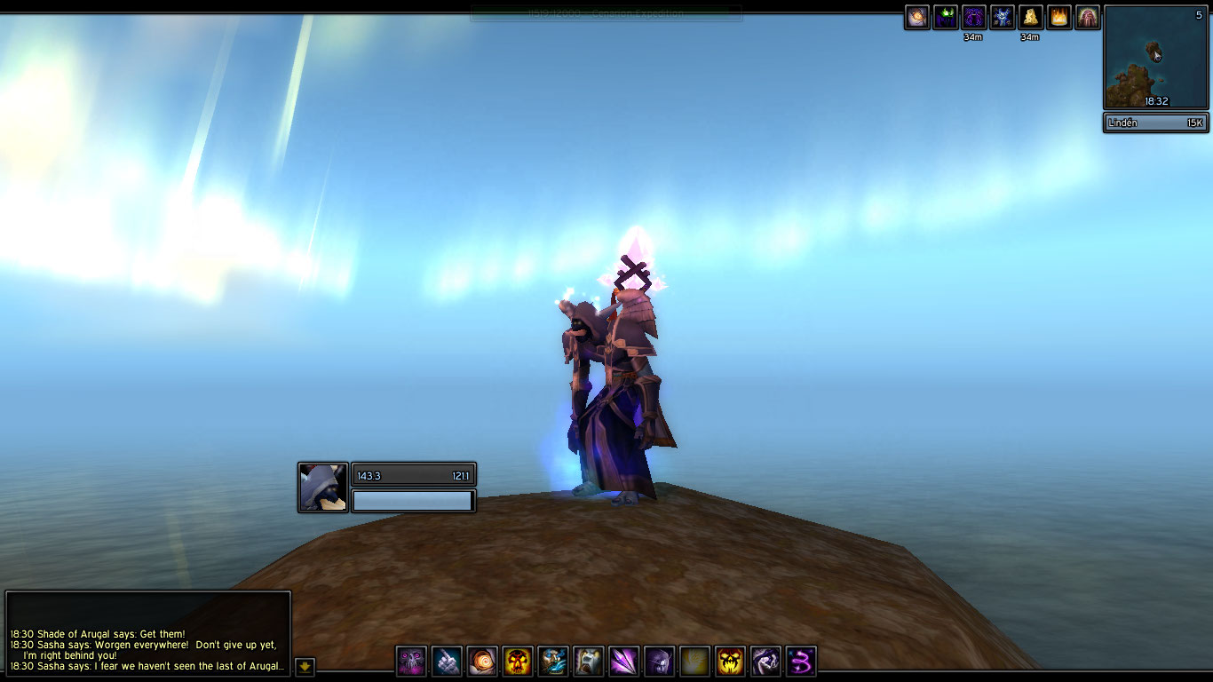 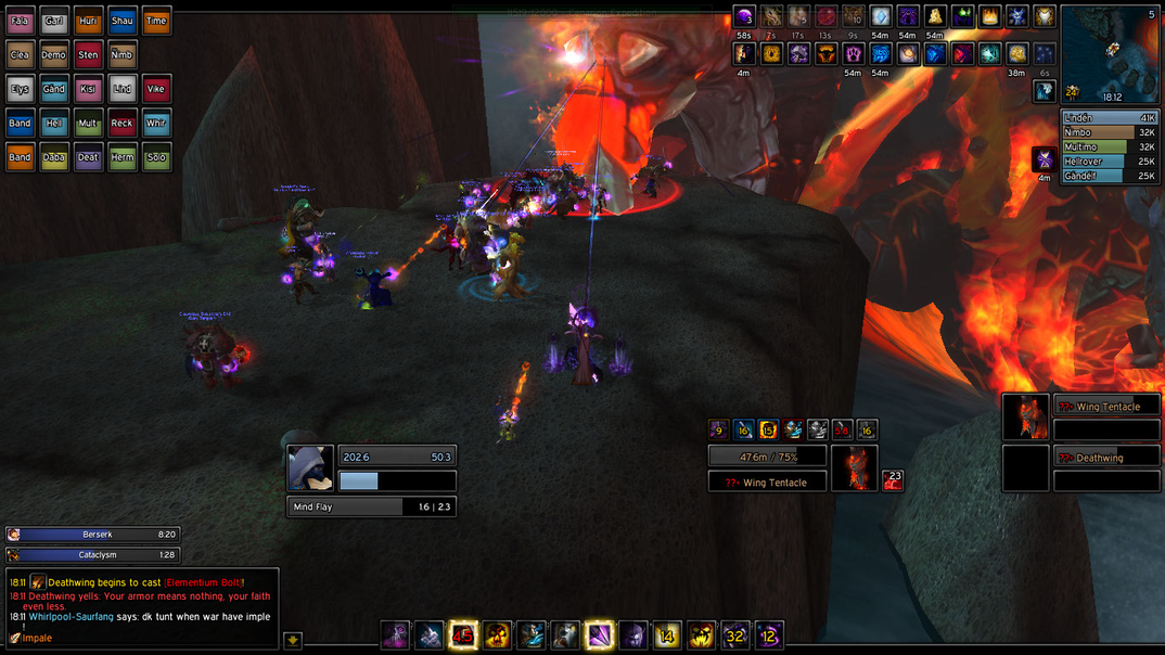 |
1 Attachment(s)
I think you've made the best possible use of your space. I played on a 1366x768 for years, and I realize how cramped it can be~
Fake edit: Those raid frames, man.....they remind me SOOO much of the original inception of oUF Diablo...I used those raid frames LONG after I stopped using RothUI, lol. I miss them ; ; Real edit: The button next to chat...that the scroll down? |
Thanks, yeah it can be really hard to make something that isn't pixel borders and fonts on a small screen like this :p
The raidframes are built up with Grid, only thing I've added are the borders using !beautycase and my bordertexture :) I was trying hard to get my own oUF raid layout going, but then thought damn, why do this when grid has got exactly what I need? It's such a great addon. And yes, that button is the scroll down one. It's not modified in any way except for the border texture. |
1. Your buffs are in no discernable order. :(
2. I don't really like how your health and mana bars are separate blocks. It makes the whole unit frame look like a cluttered blob of unrelated things that just happened to be dumped in the same spot on the screen. 3. The barely-visible reputation bar at the top of the screen is distracting. I assume it becomes opaque on mouseover... if so, it might better to make it completely invisible until moused over, or turn one of the black bars at the top/bottom of the screen into a rep bar. 4. Finally, I feel like the boss timer bars are not in a great place. Right now you've got boss unit frames and raid unit frames in opposite corners of the screen, so that's already a lot of looking around you have to do to see what's going on. It seems like the boss timers would be better placed directly above the boss frames, or directly below the raid frames. |
It's funny how almost everything you noted Phanx, are things I'm not satisfied with. Apart of the UI looking quite cluttered (I still blame my resolution, I like the visual theme), you hit all of them.
1. The truth behind the buffs is simply that I don't know how to. I think I could do it by spying on someone else's code though. It's a very good point. I rarely have a look at my buffs in combat, but I know that's because I never know where buff X or Y is located. Except for temporary weapon enchants. I'll look into it. 2. I feel what you're saying about the powerbars, I do. But the unitframes, as they are now, is in a place where I really feel comfortable with them. Only thing I've been thinking of is decreasing the height of the powerbar (and thus the portrait), because it really doesn't need to be as big as it is at the moment. However, having them separate is a thing I like a lot. I think it feels a lot more blocky having all of them tied together. 3. I'm struggling with the reputation bar, I just can't find a good place for it. I'd hate having the top panel being half green so I won't turn that into a reputation bar, but yeah. I'm having a hard time with that one. I might have to compromise. I like having it out of the way (opaque) though when I don't need to see it. 4. BigWigs, yes.. They are the main reason I feel the UI is cluttered when raiding. That, and maybe the raidframes, I think I will shrink those a bit. But placing the bars at the raid sounds like a good idea, I wil give that a try. Thanks for the input and ideas Phanx :) |
Concerning your unit frames, I did notice as well that they seemed a bit blocky. I'd try maybe shrinking the height and extending the width a bit. And I think you should reconsider having portraits for your boss frames.
For timers, I agree with Phanx that you should place them on the same side as your boss frames. I never really understood why people like having Rep bars on their screen when it's just a keybind away. Plus, I doubt that you need to see that Rep bar during a raid. I really love the uniformity with the border textures. Beautycase is an addon that I wish I could get working in conjunction with my frames and buffs but I'm too derpy for that. I don't see any problems with your buffs if they don't affect you as is. |
I really feel what you guys are saying about the unit frames, really. It just seems everything about them plays out so well now. I can fit all text inside the bars, I have places and space to put buffs and debuffs, and I just love how the castbar aligns with the buffs on the target frame. An all this with a solid spacing of 2 pixels between everything. It really feels like I've hit the thing I've been searching for whit these unit frames, except for them looking blocky. Drives me crazy.
I tried cutting the height of the powerbar by half, but it really messed it up for me :( |
| All times are GMT -6. The time now is 03:49 AM. |
vBulletin © 2024, Jelsoft Enterprises Ltd
© 2004 - 2022 MMOUI