Thread Tools Display Modes
04-20-14, 09:24 AM   #1
ObbleYeah
A Cobalt Mageweaver
AddOn Author - Click to view addons
Join Date: Sep 2008
Posts: 210
Making the default UI cleaner

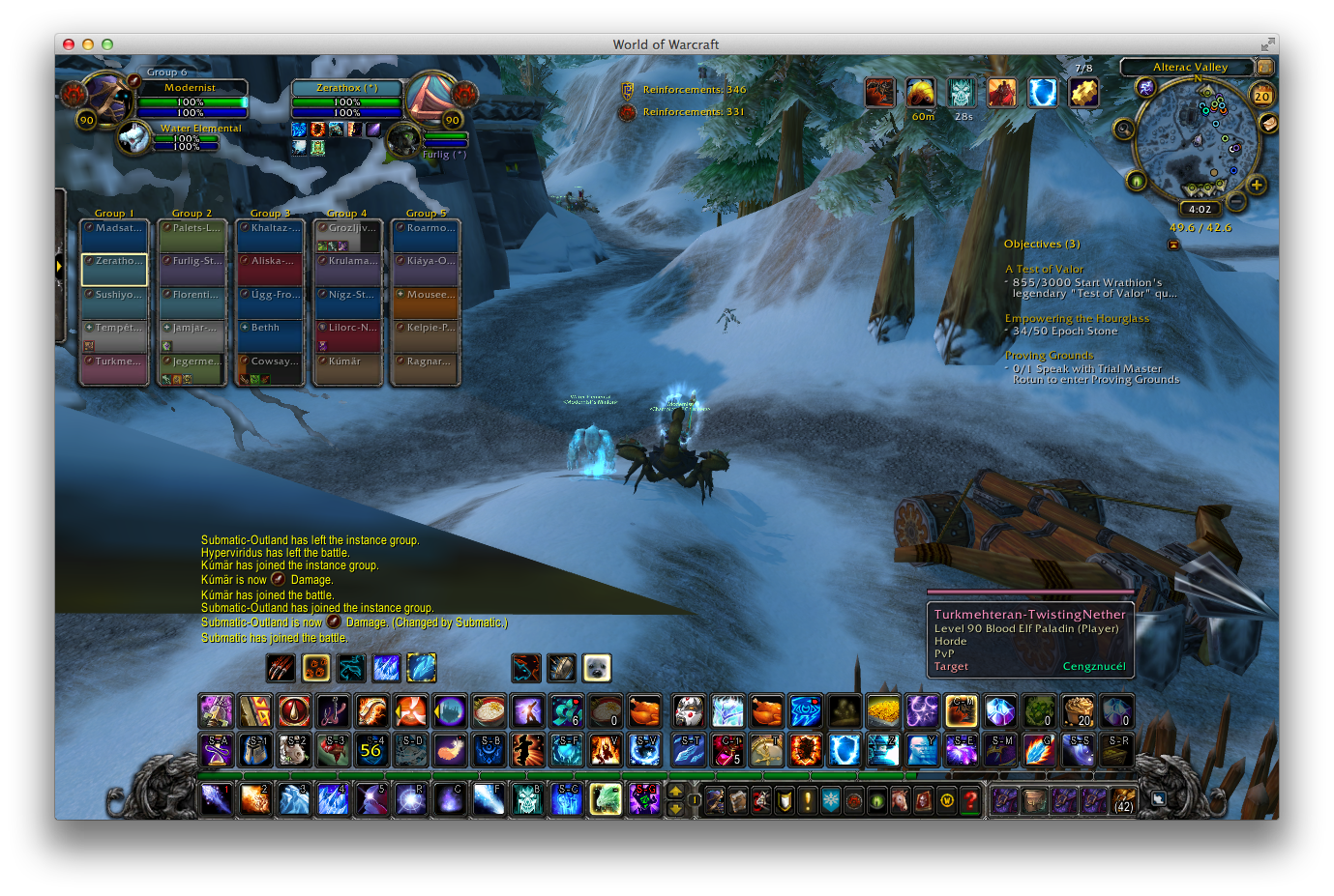
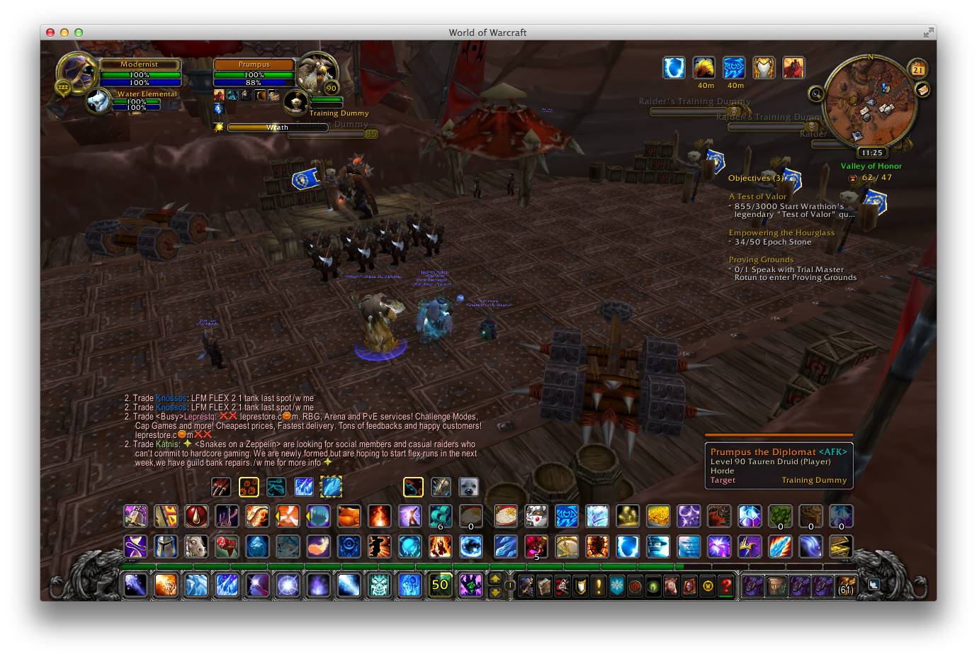
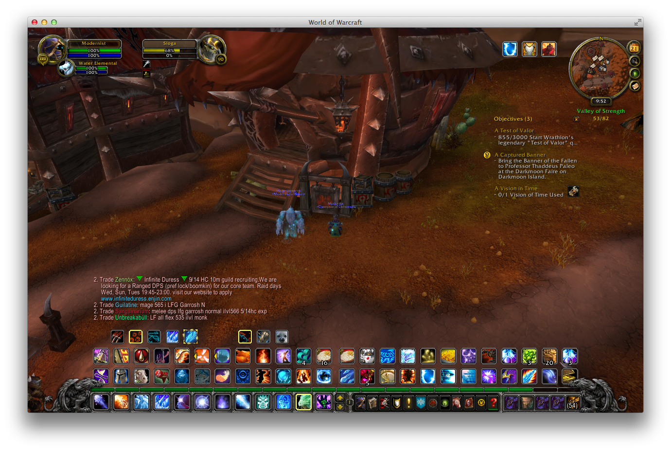
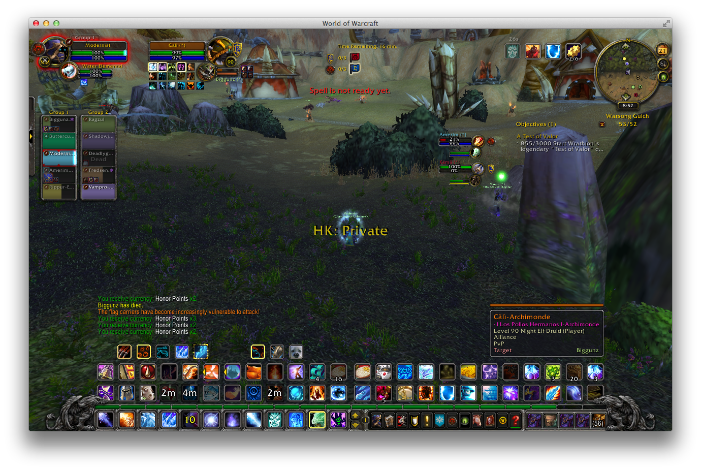
Trying to make the default UI as clean and usable as possible via subtle changes.


-

-

to do
∙ skin bars
∙ minimap
∙ clean/adjust raid frames a little
∙ ?

Last edited by ObbleYeah : 05-02-14 at 11:37 AM.
  Reply With Quote
04-20-14, 04:00 PM   #2
Nimhfree
A Frostmaul Preserver
AddOn Author - Click to view addons
Join Date: Aug 2006
Posts: 267
I would suggest perhaps the following changes as well:


-- Move the objectives over to the right now that the action bars
-- are no longer there.
local f=WatchFrame
f:SetMovable(1)
f:SetUserPlaced(true)
f:SetPoint("TOPRIGHT", MinimapCluster, "BOTTOMRIGHT", 0, 0)

-- Hide griffons
MainMenuBarLeftEndCap:Hide()
MainMenuBarRightEndCap:Hide()
  Reply With Quote
04-20-14, 04:25 PM   #3
Seerah
Fishing Trainer
 
Seerah's Avatar
WoWInterface Super Mod
Featured
Join Date: Oct 2006
Posts: 10,860
The watch frame has two points set on it already. If you wish to move it, you really should call :ClearAllPoints() on it first so that it predictably goes where you wish it to. Upon doing that, you will also need to call :SetHeight() because its height is determined by those two anchor points it already had.
__________________
"You'd be surprised how many people violate this simple principle every day of their lives and try to fit square pegs into round holes, ignoring the clear reality that Things Are As They Are." -Benjamin Hoff, The Tao of Pooh

  Reply With Quote
04-20-14, 04:34 PM   #4
ObbleYeah
A Cobalt Mageweaver
AddOn Author - Click to view addons
Join Date: Sep 2008
Posts: 210
^ Thanks, i'll play around with that and report back.

Still need to clean up the shadows on the action buttons a little and remake the texture (it came out a little too close in resemblance to Neal's ones, when I was looking for sharper angled/diagonal corners) but got a few more things done this evening:


edit: will elements like PvP objectives (ie. the capture slider and flag carrier frames) and boss frames also be moved with the WatchFrame? Would make a life a whole lot easier if that were the case.

Last edited by ObbleYeah : 04-20-14 at 04:46 PM.
  Reply With Quote
04-21-14, 03:15 PM   #5
ObbleYeah
A Cobalt Mageweaver
AddOn Author - Click to view addons
Join Date: Sep 2008
Posts: 210
I think this is just about done.


- I messed around with having the WatchFrame right below the minimap but decided I preferred it slightly out and aligned vertically with the tooltip instead. I see now that it's still a couple of points out, best correct that.
- Gryphons are a vital part of the default UI! I made them and the mainbar a little neater by layering the bottom action buttons so the corners fit under the end caps.
- Sorted boss/arena/flag & orb carrier frames to appear neatly alongside the WatchFrame, with the latter easily collapsed should 4 or more of those unit frames be up.
- Capture slider will appear at the top tucked under the objective tally.
- new sharper button texture.

might still skin icons in the WatchFrame & chat etc. at some point. Look for a font maybe (I think I used to use Gentium back in the olden days?). Really nice and easy to play with without dismantling the soul of the original interface though.
  Reply With Quote
04-21-14, 07:08 PM   #6
Phanx
Cat.
 
Phanx's Avatar
AddOn Author - Click to view addons
Join Date: Mar 2006
Posts: 5,617
It seems very cluttered at the bottom. Do you really need that many action bars? Also, have you tried hiding the unnecessary stuff, like bag bars and micro menu buttons, and tightening up the space between buttons? They're a bit far apart at the moment.

I understand your reasoning for moving the chat frame and quest tracker so far inward, but it really eats up the screen space in the middle, where it's actually important. You could mitigate that somewhat by hiding the quest tracker in combat, I guess, but having the chat frame in the middle of the screen seems really distracting.

Finally, your raid frames are gigantic, especially for a DPS class... and this is coming from someone who usually complains about everything in everyone's UI being too small to read. :P
__________________
Retired author of too many addons.
Message me if you're interested in taking over one of my addons.
Don’t message me about addon bugs or programming questions.
  Reply With Quote

WoWInterface » AddOns, Compilations, Macros » UI Screenshots, Feedback and Design Discussion » in progress


Posting Rules
You may not post new threads
You may not post replies
You may not post attachments
You may not edit your posts

vB code is On
Smilies are On
[IMG] code is On
HTML code is Off