 |
Need advice on UI layout
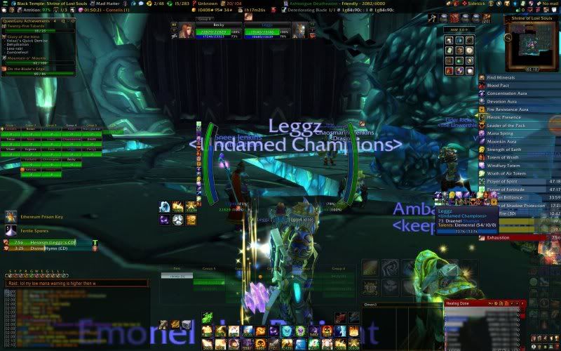
 Here is my UI in raid. In solo play player and target unitframes take place of healbot above action bars. Six buttons actionbar near player part of HUD are there for me to watch for cooldowns. Action bar over omen and recount - is my emergency spells that I need to use in haste, so the buttons are bigger. I'd like some advice on how I can improve the layout to make a screen cleaner and maybe remove some information that is repeated. Or maybe to just optimise the layout, by moving some bits around and resizing some parts. I would like some solution to buffs riding over the action bars on the right. Main clutter probably is the HUD, but I read info from it much better then from player and target unitframes. Also I'd like some suggestion on what is the best way to watch for debuffs. I have debuff watch on in healbot, but basically I just see if it's magic, disease or custom. And on some fights it's important to see who has certain debuff (like Saurfang), or how many stacks do I have (I do this one now by watching my player unitframe). When I'm shadow it's much easier to watch as I have debuffs I applied on target's unitframe. |
If those are 2 sets of raidframes, get rid of one. Try scaling down buffs so they dont overlap action bars maybe... or move the action bars.
|
Yes, disable x-perl's raid frames when using healbot (just use a different profile with it disabled so it doesn't interfere with your shadow spec if you want). As for decluttering... do you really need all 2 bars at the top of the screen for the different broker/fubar stuff? Also, do you need your mainbar (with the pvp icon, character icon, etc) and the bag bar visible at all times? Try setting them to only appear on mouseover or also see about getting used to keybinds to access the various features.
Recount and Omen can take up the same place on the UI, set Recount to only show out of combat and Omen to only show in combat. As for the buffs, is that Elkano's buffs? Is there a setting to limit the length of them or a way to define a number of columns to use? Or even a filter to remove the buffs you may not care about (auras especially)? Questguru has a handy - button to minimize it when required, feel free to take advantage of it (and disabling the border will help it blend more into the background visually and not be so jarring there in the corner). Your HUD shows buff icons on it as well as the buff bars, can you remove those icons? It'll stop the feeling of crowded-ness with your 6 button bar. Same with the debuffs, especially since you already stated that healbot monitors them for you or your x-perl unit frames do. And speaking of buffs, your tooltip addon has them displayed as well, why? Is that minimap button frame next to the minimap? How many of those icons do you really need? (Most addons have methods of disabling those, especially when you're using a broker/fubar/titanpanel display). Or alternatively, can you set that block to only display on mouseover rather than all the time? The fertile spores/ethereum prison key display on the left, is there a way to shrink it or even reduce it down to just icons rather than displaying the full text? If you make it small enough, it appears there's room underneath your mount icons for it to fit. Also on the left, your chat frame is larger in comparison to the height you have set for omen/recount on the right. To make it more balanced looking, try reducing that if possible? |
Thank you :) I will try your suggestions.
As for buff bars - that's AzCastbar. It has PlayerAuras module. But it seems Elkano Buff Bars is more customizable and I will see if it can filter buffs, or set it to several columns. Maybe even try different buff addon. |
No problem. The big thing with any UI is having it work for you. Since you complained about it feeling cluttered, the first thing I thought of was "what can be moved/removed?". The biggest thing to keep in mind is, what do you need on the screen all the time vs what is situational and then, how to make the situational items appear (mouseover, on combat, out of combat, etc). After that, the next big thing is mostly just placement and where to put things that fit with your playstyle. For me personally? I can't stand HUDs. They make me feel claustrophobic. Others I know do very very well with them.
Having a screenshot helps because you can objectively view it out of the game to see where things are and decide if you like them there or not. Enjoy tweaking :) Re: Buff bars, I only mentioned it because you said they were going over your bars on the edge. If you're happy with them, leave them and just move the bars elsewhere. Alternatively, maybe set the buttons on those bars to have keybinds associated with them so you don't have to click the button (and again, have the bar hidden if not using it). For watching debuffs, maybe sticking with Healbot won't work for you, maybe try Vuhdo? I'd suggest Grid but it requires a bit more work to set up initially. |
| All times are GMT -6. The time now is 10:42 PM. |
vBulletin © 2024, Jelsoft Enterprises Ltd
© 2004 - 2022 MMOUI