 |
New Idea, But Is It Good?
Finished a basic unit frame but I'm struggling with a proper cast bar atm. :(
 What do you think? |
It's very good! :P
|
Image broke.
|
Dude. Direct image linking is prohibited by that provider. Thus sharing the link solves the issue:
http://postimage.org/image/hajkdezqh/ I dislike the font, but the concept is nice. Do it in fantasy style and it will be perfect. |
Kind of reminds me of an alarm clock hehe. Hard to say weather or not Id like it as I would need to see the entire UI to be able to tell if Id like it. :p
|
Imageshack was down last night so I went to Google and chose the next best thing.
Here's a "proper" image:  |
Quote:
|
That looks really nice, although perhaps a bit large for the limited information it shows. I suppose it works on a big screen though. :D
|
 |
That looks better, though now you need a tad more spacing between the health icon (+) and the power percent text.
|
Looks really good, though I'd suggest adding the spell name to the cast bar, at least for units that can be NPCs (target/focus), since you won't always know the icons for every spell an NPC casts. You could even add a check that only showed the spell name when the caster is an NPC, and then put the name below the cast bar, extending the background around the text as well.
Also, make sure you distinguish between interruptible and non-interruptible spells somehow. Changing the color of the castbar would work (eg. green for spells cast by friendly units, red for interruptible spells cast by hostile units, and yellow for non-interruptible spells cast by hostile units). My main objection is that it isn't very useful for healers, since they need to see the actual amount of health, not just a percent, in order to choose the right healing spell. The non-LCD font looks much better, as well. |
Quote:
|
This is meant for my mage only and will be as minimalist as possible. Besides, if you're looking at a target frame for health/power amounts as a healer chances are you're bad. :P Raid frames will be designed at a later time. I'll try to figure out a way to show a cast name without being too bulky. I think copying the unit frame would make it too large. Thanks for all the comments/suggestions!
|
You really should use MONOCHROME when defining the font. (Removes antialiasing)
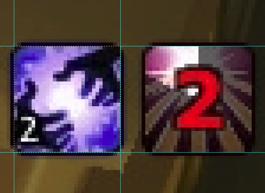
If you want to keep the look use any kind of pixel font. Question...the aura icons are photoshoped right? Those round corners are impossible to do in game. (because we cannot mask textures) |
|
Ok it works for round corners where you can hide the actual square icon texture. ;)
 |
And why do you suggest using a monochrome font setting? I despise all but one or two pixel fonts and would even then refuse to use one in my UI simply because they are overused and no longer innovative, and unfortunately pixel fonts comprise 99.9% of the fonts that work well without antialiasing.
|
Quote:
I don't raid anymore, or really even do anything with groups, but I also often targeted my primary healing target and used the keyboard to heal them, while also using click bindings on my raid frames to heal other people. Also, many DPS players like to know how much actual health their target has, rather than the percent. If you're only designing for yourself, and do not plan to ever publish the layout, then I guess it doesn't matter. |
Quote:
|
I was assuming the MONOCHROME comment was made towards the LCD/alarm clock font from the original screenshot.
|
| All times are GMT -6. The time now is 03:44 AM. |
vBulletin © 2024, Jelsoft Enterprises Ltd
© 2004 - 2022 MMOUI