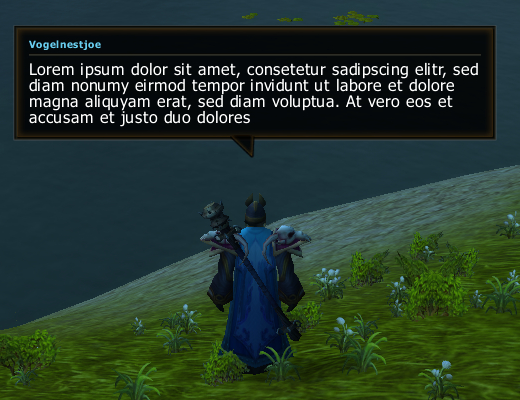
Why people love pixel fonts so much I don't get it. If the screen is so cluttered up that you need to present information with a tiny font you're doing something wrong otherwise you render too much space of your UI useless. While they may have a purpose for saving space with moot information and creating a stylized look they have poor legibility and look out of place when mixed with serif typefaces. Especially in a chat window my eyes would bleed after a short while. I can't recall that I've ever seen pixel fonts in an original video game UI other than some bitmap fonts in NES games from back in the days... rightfully so. To each his own, I suppose. Anyway, I've done some debugging and finished the chat bubbles: