Thread Tools Display Modes
10-19-09, 12:13 AM   #1441
kronpas
A Murloc Raider
Join Date: Feb 2009
Posts: 9


My last UI.

After months playing as a healer, I realized what I need most in a raid enviroment is just a well configured raid frame, with all necessary information shown as I wish.

@Limbo: I dont really get it why ppl put mini map into such a precious position. As a healer, its reserved for the raid frame, where most of my activities centered around. As a dps, most of the time I stare at target debuff bar and my mana/rage/energy, also at middle-bottom of the screen. I dont have any tank toon, but from my dps and heal experience, none of 10 classes, out of 30 specs needs a mini map at middle-bottom of the screen to do their job

I m a minimalist, so I always try to hide/minimized necessary frame if possible. You can save a lot of screen space if you turn off duration bars for buff like AI, shout, aura etc., hide recount window(s), and make the raid frame smaller.

Also, your button facade skin choice makes thing really hard to figure out. I can barely know what are the icons under those thick black border button.

Last edited by kronpas : 10-19-09 at 12:15 AM.
 
10-20-09, 12:23 PM   #1442
Limb0
A Cobalt Mageweaver
 
Limb0's Avatar
AddOn Author - Click to view addons
Join Date: Feb 2008
Posts: 220
Originally Posted by kronpas View Post
@Limbo: I dont really get it why ppl put mini map into such a precious position. As a healer, its reserved for the raid frame, where most of my activities centered around. As a dps, most of the time I stare at target debuff bar and my mana/rage/energy, also at middle-bottom of the screen. I dont have any tank toon, but from my dps and heal experience, none of 10 classes, out of 30 specs needs a mini map at middle-bottom of the screen to do their job

I m a minimalist, so I always try to hide/minimized necessary frame if possible. You can save a lot of screen space if you turn off duration bars for buff like AI, shout, aura etc., hide recount window(s), and make the raid frame smaller.

Also, your button facade skin choice makes thing really hard to figure out. I can barely know what are the icons under those thick black border button.
These are good points.

-Centered MiniMap ..I give this a priority since position is very important in raid and battleground environments. As a DPS class, there is constant movement on many fights where it's easy to get disoriented, so the map is there to see where you're pointed. I also find it beneficial for gathering, especially if you're flagged pvp and might need to react quickly.

-As I've stated before, my UI is not catered towards healing classes (not yet). From studying many UIs on many of the top sites, having centered raid frames seem the most logical, and this would make me shift many elements of the UI around. Also I would have to compare Grid and Decursive to Stuf and try to bridge the gaps. As a non Healer, the position of the Raid Frames are not a priority and are used to give information about who is in combat, dead, oor, dc, etc. I love healers, but they need a completely different layout than Melee, Ranged or Tanks do.

-As a DPS, all of the buttons which hold my macros, abilites/spells, and item cooldowns are on the right side of the minimap. This cluster is what I reference while in combat. The left side buttons are other misc macros which apply while ooc, and would be hidden if not for symmetry. Above the actionbars, on the left side, Target Debuffs are tracked. Right side, Player Self Buffs and certain Ability Cooldowns are tracked via customized RoguePowerBars. This lets me stay on top of my "rotation." Player HP, Mana/Energy/Rage, Combo Points, Threat, Target HP and M/E/R, and Target of Target's HP are all monitored via the HUD (as well as the unit frames, Threat via Omen).

-ButtonFacade border ..round minimap, round border since the actionbars are married to the minimap for RenUI. Round borders clip the edges of the buttons, which does make it harder to see, but I feel it shows you enough to tell still, and to be brutally honest, I could have every button be solid black and still know what each one is.

--
One thing in your post that has me is that you claim to be a minimalist, yet from your screen, your UI is using 118.7MB.. My UI in full 25 Raid environment with Recount globally collecting doesn't even reach half of this and I have a lot of extra bells and whistles. Minimalism to my understanding was using as little as possible with the smallest memory usage.

Your latency is 305ms, I suggest checking out LeatrixLatencyFix which should reduce that by 1/2-2/3, and will improve your game.

If you have tips for me to increase my damage done, feel free to pm me, I'm always looking to improve my game.
 
10-20-09, 12:54 PM   #1443
Dawn
A Molten Giant
 
Dawn's Avatar
AddOn Author - Click to view addons
Join Date: May 2006
Posts: 918
Minimalism isn't attached to addon memory usage at all. The point of minimalism is having an UI layout that tries to show all the needed information while hiding unneeded information. That's about it. All other things like screen clutter and whatnot aren't attached to any typ of UI layout, may it be minimalism, graphical (lot's of art), whatever, ... I have seen UIs that call them self minimal and are cluttered like whatnot and I've seen graphical UIs that are well layed out (even though there are really really view of them).

That being said, a good example of what you can improve (from point of view) are basic things that create a solid, out of the box look.

1. choose one font, maybe two for all parts of your UI (including chat)
2. same goes for bar textures
3. don't overuse colors, which doesn't mean make everything black or grey! just think about where you need to look at and what you need to look at.
one example: highlighting debuffs via their corresponding color is good. having all bars class colored at the same time is bad it distracts your eyes and you might even not see the debuff on some classes.
4. get rid of useless and doubled information.
examples:
- using a HUD and also show a player and target frame...
- using an in-combat icon for every frame, because it's great to know that your raid is in combat or the target your hitting at, at any time, right? Not, it's obvious.
...

There are way more things that need attention. Like position and size of frames. Don't overuse timer bars, or bars in general. Having buff bars is generally not needed, because an icon can show the exactly same information in like 1/8 of the screen space a bar needs. Filter debuffs (and to some extent even buffs on some frames), etc.
 
10-20-09, 12:57 PM   #1444
Hakula
A Murloc Raider
 
Hakula's Avatar
Join Date: Oct 2009
Posts: 9
Here is what my UI looks like.
Attached Thumbnails
Click image for larger version

Name:	WoWScrnShot_102009_135557.jpg
Views:	909
Size:	289.1 KB
ID:	3509  
__________________
"Life is meaningless. It is in death that we are truly tested." - Baron Rivendare
 
10-20-09, 08:30 PM   #1445
kronpas
A Murloc Raider
Join Date: Feb 2009
Posts: 9
@Limb0: Im not arguing with you, just express my opinion, so you may consider designing your UI to meet as many players' need as possible. An UI can be very look-appealing, but so hard to use as the author arrange its elements to suit his own playstyle. People download, then remove it only a day later. Take my UI as an example: my fellow healers really like its look, but never ask me to share as they cant raid without button actionbar as I do

One thing in your post that has me is that you claim to be a minimalist, yet from your screen, your UI is using 118.7MB.. My UI in full 25 Raid environment with Recount globally collecting doesn't even reach half of this and I have a lot of extra bells and whistles. Minimalism to my understanding was using as little as possible with the smallest memory usage.

Your latency is 305ms, I suggest checking out LeatrixLatencyFix which should reduce that by 1/2-2/3, and will improve your game.

If you have tips for me to increase my damage done, feel free to pm me, I'm always looking to improve my game.
About minimalism, Dawn said it all for me. My UI was once even more "trimmed down", to the point there were only raid frame, chat frame and a small filtered buff bar which all took up like less than half the amount of space you seen in my screenshot. But it also was really inconvenient for chatting, so I made chat frame larger, then the UI as it s now. It may not be "minimal" in raid enviroment anymore, I admit :"(

Of over 100MB memory, a third contributed to Recount, another third to an addon I forgot atm. Theres no way to reduce it after 4 raid hours, and I find it not affect my FPS much (only 1-2FPS), so no problem.

Im not living in US, my lowest possible ping with tunnel is 200, and I had to raid without it to prevent random disconnect. Thank for the addon suggestion though.

Last edited by kronpas : 10-20-09 at 08:40 PM.
 
10-22-09, 10:22 PM   #1446
Dawn
A Molten Giant
 
Dawn's Avatar
AddOn Author - Click to view addons
Join Date: May 2006
Posts: 918
Be aware, alien invasion ... must warn ... *pewpew* ... argh!


druid mana ftw ...


A little WIP I'm working on, unitframes are oUF (based on viv), the "smoke" (health) fills vertical (inspired by Zorks orbs).

Needs major code clean up, position fixes, etc .. and maybe moooore alien heads for party frame
 
10-23-09, 01:18 AM   #1447
Oumi
A Murloc Raider
Join Date: Oct 2009
Posts: 4
 
10-24-09, 03:40 AM   #1448
Zyonin
Coffee powered Kaldorei
 
Zyonin's Avatar
AddOn Author - Click to view addons
Join Date: May 2006
Posts: 1,443
I don't think I ever showed off my last UI here yet. This is my current work in progress however it's currently on hold as my account is trapped by a glacier (frozen due to a lack of money thus I am semi-retired).

I went with a minimalist approach however everything is handy when needed. Under the main bar is a second bar of 14 buttons that appears upon entering combat (and hides upon exiting combat). This actually makes a nice "In Combat" indicator. In addition, two smaller 8 button bars (in a 4x2 pattern) flank the main and secondary bar. Those smaller bars appear on mouseover and contain things like most used mounts, long duration buffs, buff munchies and the like. Everything is keybound. Above my player frame is my Forte Xorcist timers while Forte's CD bar appears under the action bars (no CD's active so it's hidden in that SS).

This was (and still is once I get back in a few months once my machine is replaced/rebuilt) a work in progress so some things are out of place such as the quest tracker is visible (only quests that in that area should be seen via the "tracked" tracker) and some Broker plug-ins are seen twice. The quest tracker is now hidden in my latest version. However even in this state it is quite usable, fast (even on my old hardware) and will be a great UI to use for raiding.

The black dot in the upper part of the SS is not a part of the UI, it's a Paintshop Pro error (misclick with the airbrush tool active) that I did not catch prior to uploading that. Oops


Mods used:
  • oUF (with oUF Nivaya)
  • Macaroon!
  • PhanxChat (blurred as the guild alliance channel was a bit "interesting" that night and was not NSFW)
  • Chinchilla
  • kgPanels (around the UFs/main bar)
  • DockingStation (info at the top right and bottom corners)
  • Carousel (upper left corner, holds Broker plug-ins that I don't need displayed all the time, many are on autoshow such as my Guild and Roll plug-ins)
  • various Broker feeds (launchers are largely hidden on the Carousel bar)
  • StatrinaBuffFrame
  • Eavesdrop
  • BetterQuest
  • DeathKnight.info Runes
In addition major mods in use (but not seen/hidden in the screenshot) include LyMedia (custom texture mod), LySettings (custom UI settings containing a fair bit of custom code plus code from smaller mods that I like and have tweaked to taste), !ClassColors, MiksScrollingBattleText, Clique (for my healer alt), Camma's UI textures, caelNameplates (a customized fork), Quartz, Outfitter (outfit bar is hidden just above my chat), and assorted oUF plugins to support my oUF layout.

Fonts used: ExpresswayFree is the main one used by most of the visible mods including oUF_Nivaya and Eavesdrop, WoW UI (including Chat) fonts is Bitstream Vera Sans Bold
Texture used: Bars - Minimalist (from SharedMedia), custom textures via LyMedia. The default Blizzard UI elements have been replaced by Camma's wonderful frames.
__________________
Twitter

Last edited by Zyonin : 10-24-09 at 03:58 AM.
 
10-26-09, 10:35 AM   #1449
Monolit
A Black Drake
AddOn Author - Click to view addons
Join Date: Jan 2006
Posts: 81


This's an attempt to create decently looking and useful arena frames with oUF

Can't figure out a better place to position cast bar though :/
The only thing I could think about is placing it under the frames and moving buffs/debuffs to the right. So I'd appreciate any advices :]
 
10-26-09, 12:28 PM   #1450
pHishr
A Flamescale Wyrmkin
 
pHishr's Avatar
AddOn Author - Click to view addons
Join Date: Dec 2008
Posts: 105
Originally Posted by Monolit View Post


This's an attempt to create decently looking and useful arena frames with oUF

Can't figure out a better place to position cast bar though :/
The only thing I could think about is placing it under the frames and moving buffs/debuffs to the right. So I'd appreciate any advices :]
I like those unitframes
 
10-27-09, 08:44 AM   #1451
zork
A Pyroguard Emberseer
 
zork's Avatar
AddOn Author - Click to view addons
Join Date: Jul 2008
Posts: 1,740
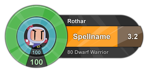
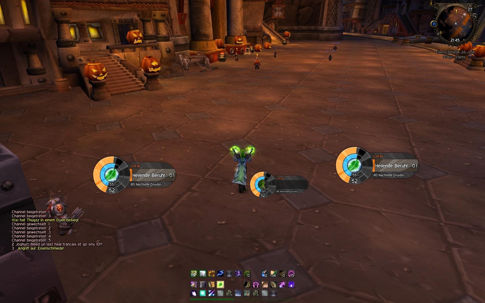
Something I am currently working on:


I hope I can get it to work with oUF_RingThing.
__________________
| Simple is beautiful.
| WoWI AddOns | GitHub | Zork (WoW)

"I wonder what the non-pathetic people are doing tonight?" - Rajesh Koothrappali (The Big Bang Theory)
 
10-27-09, 08:57 AM   #1452
zero-kill
A Firelord
 
zero-kill's Avatar
Join Date: Aug 2009
Posts: 497
Originally Posted by zork View Post
Something I am currently working on:


I hope I can get it to work with oUF_RingThing.
This looks familiar.

Edit: was thinking of this.

Last edited by zero-kill : 10-27-09 at 08:59 AM.
 
10-27-09, 09:14 AM   #1453
Dawn
A Molten Giant
 
Dawn's Avatar
AddOn Author - Click to view addons
Join Date: May 2006
Posts: 918
Err, that's a whole different story. Even if you put the map into the middle of the circle bars ...
 
10-27-09, 09:15 AM   #1454
zork
A Pyroguard Emberseer
 
zork's Avatar
AddOn Author - Click to view addons
Join Date: Jul 2008
Posts: 1,740
... rings?
__________________
| Simple is beautiful.
| WoWI AddOns | GitHub | Zork (WoW)

"I wonder what the non-pathetic people are doing tonight?" - Rajesh Koothrappali (The Big Bang Theory)
 
10-27-09, 03:07 PM   #1455
pHishr
A Flamescale Wyrmkin
 
pHishr's Avatar
AddOn Author - Click to view addons
Join Date: Dec 2008
Posts: 105
Originally Posted by zork View Post
Something I am currently working on:


I hope I can get it to work with oUF_RingThing.
That'd be so ****ing ace!
 
10-27-09, 03:13 PM   #1456
zork
A Pyroguard Emberseer
 
zork's Avatar
AddOn Author - Click to view addons
Join Date: Jul 2008
Posts: 1,740


http://www.wowinterface.com/download...RingThing.html
__________________
| Simple is beautiful.
| WoWI AddOns | GitHub | Zork (WoW)

"I wonder what the non-pathetic people are doing tonight?" - Rajesh Koothrappali (The Big Bang Theory)
 
10-28-09, 05:22 AM   #1457
Monolit
A Black Drake
AddOn Author - Click to view addons
Join Date: Jan 2006
Posts: 81
Nice concept zork, maybe less conservative people than me will find a use for that kind of frames :] But they look grate though.

on a side note:


added arena target's targets frames

Now it actualy looks like a decent gladius replacement!
 
10-31-09, 06:16 PM   #1458
Ketevan
A Defias Bandit
 
Ketevan's Avatar
AddOn Compiler - Click to view compilations
Join Date: Oct 2009
Posts: 3
Here's mine, after tons of editing the little things.


Although I have been trying to create something new.
Come on creativity, come back!
__________________
Crocodiles of sun-soaked kids, in sexy sandals, heaven forbid.
For kisses good enough to eat, all you need is two bare feet.

Last edited by Ketevan : 10-31-09 at 06:31 PM.
 
10-31-09, 06:23 PM   #1459
nightcracker
A Molten Giant
 
nightcracker's Avatar
AddOn Author - Click to view addons
Join Date: Sep 2009
Posts: 716


Look at that sexy memory usage on the bottomz
 
10-31-09, 09:38 PM   #1460
zero-kill
A Firelord
 
zero-kill's Avatar
Join Date: Aug 2009
Posts: 497
Originally Posted by nightcracker View Post

Look at that sexy memory usage on the bottomz
Sorry I was busy looking elsewhere.
 

WoWInterface » AddOns, Compilations, Macros » UI Screenshots, Feedback and Design Discussion » Screen Shots of your UI...


Posting Rules
You may not post new threads
You may not post replies
You may not post attachments
You may not edit your posts

vB code is On
Smilies are On
[IMG] code is On
HTML code is Off