Thread Tools Display Modes
03-21-11, 06:52 PM   #401
Lily.Petal
A Molten Giant
 
Lily.Petal's Avatar
AddOn Author - Click to view addons
Join Date: Feb 2010
Posts: 540
Originally Posted by Petrah View Post
I really love how you've done the UI. I think the only thing that kind of throws it off though are the missing pixel borders for your unit frames. Add those and it'll be totally awesome!
I'll try it, though I think it would be kinda odd. Ill add it around player frame then post

I think I would have to make the frames transparent in order to make it actually match though.
__________________

Aggro Color to KG Panels Borders - Nibelheim
Lua Based UI Hider - Nibelheim
Custom LUA PowerText - Stuf - Nibelheim, Seerah
 
03-21-11, 06:57 PM   #402
Tanthalus
An Aku'mai Servant
 
Tanthalus's Avatar
Join Date: Jan 2006
Posts: 35
Originally Posted by hankthetank View Post
Why people love pixel fonts so much I don't get it.
The point of them is missed in a lot of UIs. Pixel fonts have their place, and it depends on the UI author to have some good taste in not putting the font in horribly ugly places, like being chat, quest, scrolling combat text and overhead damage font to name a few. They just look horrible there.

A few of the places pixel fonts excel in are: (Must have MONOCHROME mod to look its best with shadow set to (0, 0)
  • Keybinds.
  • Coords on Minimap
  • Raid Unit frames
  • Stack count on small icons (<20pixels) Usually class timers or target UF debuffs
  • -Very- minimalistic UIs

Last edited by Tanthalus : 03-21-11 at 07:06 PM.
 
03-21-11, 06:58 PM   #403
Lily.Petal
A Molten Giant
 
Lily.Petal's Avatar
AddOn Author - Click to view addons
Join Date: Feb 2010
Posts: 540
Well... here it is xD unit frames go~ looks kinda odd to me still :P

There is a border though behind the UF's, the shadowy border at least as seen in Image2 when I have threat. Also, 3rd Image shows party frames. And ops, apparently something happened to my threat~ Dps bars z.z gotta look at it.

Originally Posted by Tanthalus View Post
The point of them is missed in a lot of UIs. Pixel fonts have their place, and it depends on the UI author to have some good taste in not putting the font in horribly ugly places, like being chat, quest, scrolling combat text and overhead damage font to name a few. They just look horrible there.
Actually, depending on the pixel font, (i am using one that has lower and uppercase letters) quest text is fine with one. Chat does look awful, and ya, I can't seem to use pixel font well in a scrolling battle text.
--Example of my quest text is in image3 below.

I am using a mixture of Swfit and Supernat1001 for my fonts, swfit for UnitFrames, and data text, and supernat for like quest text, my exp bar minimap and some other things. Pixel fonts have a lot of varieties and uses
Attached Thumbnails
Click image for larger version

Name:	Untitled4.png
Views:	700
Size:	32.2 KB
ID:	5890  Click image for larger version

Name:	Untitled2.png
Views:	620
Size:	65.7 KB
ID:	5891  Click image for larger version

Name:	WoWScrnShot_032111_183117.jpg
Views:	742
Size:	663.3 KB
ID:	5892  
__________________

Aggro Color to KG Panels Borders - Nibelheim
Lua Based UI Hider - Nibelheim
Custom LUA PowerText - Stuf - Nibelheim, Seerah

Last edited by Lily.Petal : 03-21-11 at 07:10 PM.
 
03-21-11, 07:19 PM   #404
Tanthalus
An Aku'mai Servant
 
Tanthalus's Avatar
Join Date: Jan 2006
Posts: 35
Originally Posted by Lily.Petal View Post
Well... here it is xD unit frames go~ looks kinda odd to me still :P

There is a border though behind the UF's, the shadowy border at least as seen in Image2 when I have threat. Also, 3rd Image shows party frames. And ops, apparently something happened to my threat~ Dps bars z.z gotta look at it.


Actually, depending on the pixel font, (i am using one that has lower and uppercase letters) quest text is fine with one. Chat does look awful, and ya, I can't seem to use pixel font well in a scrolling battle text.
--Example of my quest text is in image3 below.

I am using a mixture of Swfit and Supernat1001 for my fonts, swfit for UnitFrames, and data text, and supernat for like quest text, my exp bar minimap and some other things. Pixel fonts have a lot of varieties and uses
Id move your UF information inside the health bar and set them to Monochrome, shadow 0,0 and hidden when at full health OOC, Other than that they look good. Pixel fonts love an outline to make them excel at what they are used for; high contrast in low real estate areas.
 
03-21-11, 08:15 PM   #405
Tanthalus
An Aku'mai Servant
 
Tanthalus's Avatar
Join Date: Jan 2006
Posts: 35
Here is my a WIP:


Last edited by Tanthalus : 03-21-11 at 08:21 PM.
 
03-21-11, 08:52 PM   #406
Aprikot
A Frostmaul Preserver
 
Aprikot's Avatar
AddOn Author - Click to view addons
Join Date: Feb 2010
Posts: 284
Originally Posted by Tanthalus View Post
Here is my a WIP:

Looks good (a bit like Jasje Tukui). I like the background strata of the actionbar panel, was that intentional?
 
03-22-11, 09:44 AM   #407
Remsaa
A Deviate Faerie Dragon
AddOn Author - Click to view addons
Join Date: Feb 2007
Posts: 19
I have the following mods

Archy
Grid
Prat
Move Anything
Bartender 4
Bagnon
Doom Cooldown Pulse
Lose Control
Nug ComboBar
TidyPlates
OmniCC
Skada
Power Auras
Iinterupptedthat
KGPanels
Button Façade (or whatever replaced it)

The background I made specifically for my rogue (although my DK uses it as well) The paladin has different artwork which I might submit at a later time.
The artwork has elements from the Diablo III Official Website, Rothui (map background) and hacked up bits from several images from a wonderful interface artist known by Hunqwert on deviantart.


03-22-11, 11:44 AM   #408
Mischback
A Cobalt Mageweaver
 
Mischback's Avatar
AddOn Author - Click to view addons
Join Date: Aug 2009
Posts: 221
The artwork is really well done, though I simply can not stand those standard UFs... looks terrible and ruins all the great work you put into it.
The minimap is the other spot I would change... (Nearly) standard map doesn't fit the rest of the (changed) stuff...
__________________
 
03-22-11, 11:47 AM   #409
Remsaa
A Deviate Faerie Dragon
AddOn Author - Click to view addons
Join Date: Feb 2007
Posts: 19
Originally Posted by Mischback View Post
The artwork is really well done, though I simply can not stand those standard UFs... looks terrible and ruins all the great work you put into it.
The minimap is the other spot I would change... (Nearly) standard map doesn't fit the rest of the (changed) stuff...
Do you have a suggestion for something I can do about the UFs but not lose the "artsy" feel, or I am not sure where I would start to making my own, the graphics part Im not worried about, its all the rest...

Good point about the map not fitting, I will be making a new one today

Thanks for the comments and advice
 
03-22-11, 11:49 AM   #410
Mischback
A Cobalt Mageweaver
 
Mischback's Avatar
AddOn Author - Click to view addons
Join Date: Aug 2009
Posts: 221
Check out oUF and the great layout by zork, it may be a starting point.

I guess you have already messed with Blizz-Lua, so oUF should provide you a sufficient framework to create "fitting" unitframes.
__________________
 
03-22-11, 02:56 PM   #411
Oraknathal
A Flamescale Wyrmkin
 
Oraknathal's Avatar
Join Date: Sep 2010
Posts: 143
Originally Posted by Tanthalus View Post
Here is my a WIP:

I really like this UI its very clean I especially love the tooltip. What addon are you using for it?
 
03-22-11, 05:06 PM   #412
SRCarebear
A Fallenroot Satyr
AddOn Compiler - Click to view compilations
Join Date: Mar 2009
Posts: 26
Not quite sure what to do with my Skada and DBM. Any suggestions?
Attached Thumbnails
Click image for larger version

Name:	WoWScrnShot_032211_230136.jpg
Views:	1408
Size:	874.9 KB
ID:	5894  
 
03-22-11, 05:22 PM   #413
haylie
A Scalebane Royal Guard
 
haylie's Avatar
Join Date: May 2009
Posts: 417
Originally Posted by Lily.Petal View Post
Well... here it is xD unit frames go~ looks kinda odd to me still :P
Why is your chat box in the middle of the screen?

Originally Posted by SRCarebear View Post
Not quite sure what to do with my Skada and DBM. Any suggestions?
Bottom right. No use reinventing the wheel here.

Originally Posted by Remsaa View Post
I have the following mods
I actually think the default UFs would look good if they weren't so small compared to the rest of your UI elements. As it stands right now, the artwork draws attention away from them, which is never a good idea.
 
03-22-11, 05:39 PM   #414
SRCarebear
A Fallenroot Satyr
AddOn Compiler - Click to view compilations
Join Date: Mar 2009
Posts: 26
Originally Posted by haylie View Post
Bottom right. No use reinventing the wheel here.
Tooltip goes there!

Just place it here after joining a party though.
Attached Thumbnails
Click image for larger version

Name:	WoWScrnShot_032211_233514.jpg
Views:	732
Size:	470.6 KB
ID:	5895  
 
03-22-11, 06:46 PM   #415
Porsha
A Black Drake
Join Date: Apr 2008
Posts: 88
My new one...digging it pretty much so far.


showing tooltip and target buff/debuffs


Last edited by Porsha : 03-22-11 at 07:41 PM.
 
03-23-11, 01:55 AM   #416
Oraknathal
A Flamescale Wyrmkin
 
Oraknathal's Avatar
Join Date: Sep 2010
Posts: 143
Originally Posted by SRCarebear View Post
Not quite sure what to do with my Skada and DBM. Any suggestions?
what are you using for those raid frames they look really elegant.
 
03-23-11, 02:14 AM   #417
Nerielle
A Cyclonian
 
Nerielle's Avatar
AddOn Author - Click to view addons
Join Date: Jul 2008
Posts: 47
Originally Posted by Lily.Petal View Post
I think the NibPD needs to be more 'slim' takes a lot of your bar imo.
That's pretty much stock from ledUI, though I understand what you mean. I will look into making them slimmer. And the combat shot I will get tonight, forgot on Monday
 
03-23-11, 04:37 AM   #418
SRCarebear
A Fallenroot Satyr
AddOn Compiler - Click to view compilations
Join Date: Mar 2009
Posts: 26
Originally Posted by Oraknathal View Post
what are you using for those raid frames they look really elegant.
They are part of my oUF.
 
03-23-11, 05:43 AM   #419
sakurakira
A Chromatic Dragonspawn
 
sakurakira's Avatar
AddOn Author - Click to view addons
Join Date: Jul 2008
Posts: 151
Originally Posted by SRCarebear View Post
Tooltip goes there!

Just place it here after joining a party though.
Vortex Pinnacle at night is one of my faves, nice shot!
__________________
Arise, my champion!
 
03-23-11, 06:02 AM   #420
harizon
A Fallenroot Satyr
 
harizon's Avatar
Join Date: Oct 2010
Posts: 21
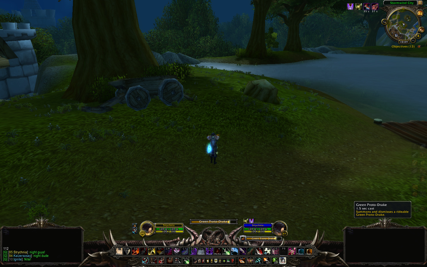
In my continuing effort to learn putting together a UI, this is my latest offspring.
Not reinventing the wheel. Merely taking a square piece of metal and hitting it until it sorta looks round-ish.


WoWInterface » AddOns, Compilations, Macros » UI Screenshots, Feedback and Design Discussion » UI Feedback Thread


Posting Rules
You may not post new threads
You may not post replies
You may not post attachments
You may not edit your posts

vB code is On
Smilies are On
[IMG] code is On
HTML code is Off