| 11-26-07, 11:37 AM | #1 | |
|
A Cliff Giant

Join Date: Apr 2007
Posts: 73
|
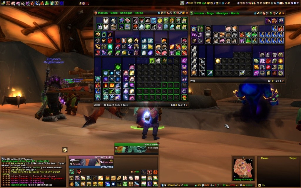
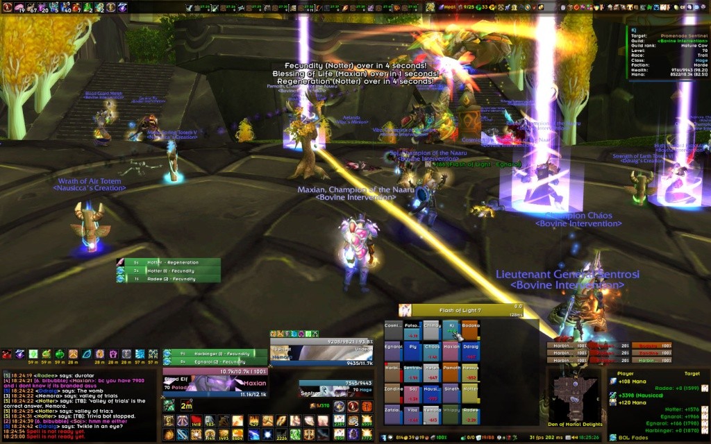
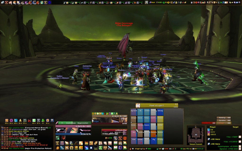
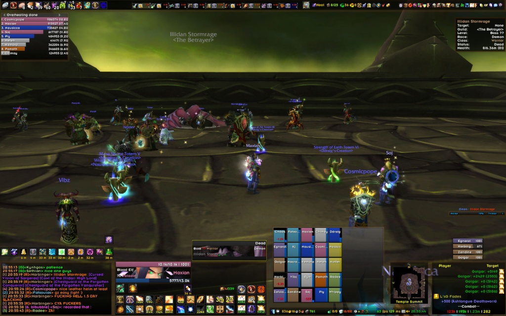
Max UI
Last edited by Maxian : 11-26-07 at 05:28 PM. |
|

|


| 11-26-07, 11:58 AM | #2 | |
|
A Flamescale Wyrmkin

Join Date: Sep 2007
Posts: 144
|
||
|
|
| 11-26-07, 12:06 PM | #3 | |
|
A Cliff Giant
Join Date: Apr 2007
Posts: 73
|
||
|
|
| 11-26-07, 12:11 PM | #4 | |
|
A Flamescale Wyrmkin
Join Date: Sep 2007
Posts: 144
|
||
|
|
| 11-26-07, 12:14 PM | #5 | |
|
Coffee powered Kaldorei

Join Date: May 2006
Posts: 1,443
|
__________________
|
|
|
|
| 11-26-07, 12:29 PM | #6 | |
|
A Cliff Giant
Join Date: Apr 2007
Posts: 73
|
Last edited by Maxian : 11-26-07 at 05:30 PM. |
|
|
|
| 11-26-07, 04:24 PM | #7 | |
|
Fishing Trainer

Join Date: Oct 2006
Posts: 10,860
|
__________________
"You'd be surprised how many people violate this simple principle every day of their lives and try to fit square pegs into round holes, ignoring the clear reality that Things Are As They Are." -Benjamin Hoff, The Tao of Pooh  |
|
|
|
| 11-26-07, 05:34 PM | #8 | |
|
A Cliff Giant
Join Date: Apr 2007
Posts: 73
|
||
|
|

| 11-28-07, 06:44 AM | #9 | |
|
A Cliff Giant
Join Date: Apr 2007
Posts: 73
|
||
|
|
")
| 11-28-07, 08:59 AM | #10 | |
|
A Rage Talon Dragon Guard

Join Date: Apr 2005
Posts: 335
|
||
|
|
 Good job!
| 11-28-07, 09:56 AM | #11 | |
|
A Kobold Labourer

Join Date: Aug 2006
Posts: 1
|
||
|
|
| 11-28-07, 11:05 AM | #12 | |
|
A Cliff Giant
Join Date: Apr 2007
Posts: 73
|
Last edited by Maxian : 11-28-07 at 11:07 AM. |
|
|
|
| 11-28-07, 12:15 PM | #13 | |
|
A Rage Talon Dragon Guard
Join Date: Apr 2005
Posts: 335
|
||
|
|
| 11-28-07, 04:00 PM | #14 | |
|
A Rage Talon Dragon Guard

Join Date: Oct 2007
Posts: 311
|
||
|
|
| 11-28-07, 04:42 PM | #15 | |
|
A Cliff Giant
Join Date: Apr 2007
Posts: 73
|
||
|
|
| 11-28-07, 05:14 PM | #16 | |
|
A Murloc Raider
Join Date: Nov 2007
Posts: 5
|
||
|
|
| 11-28-07, 09:34 PM | #17 | |
|
A Rage Talon Dragon Guard
Join Date: Oct 2007
Posts: 311
|
||
|
|
| 11-29-07, 03:57 PM | #18 | |
|
A Cliff Giant
Join Date: Apr 2007
Posts: 73
|
||
|
|
| 11-29-07, 04:30 PM | #19 | |
|
A Rage Talon Dragon Guard
Join Date: Oct 2007
Posts: 311
|
||
|
|
| 11-30-07, 09:16 AM | #20 | |
|
A Cliff Giant
Join Date: Apr 2007
Posts: 73
|
||
|
|

 Linear Mode


WoWInterface
AddOn Sites
© 2004 - 2022 MMOUI
vBulletin © 2024, Jelsoft Enterprises Ltd