UI Screenshot Gallery
What is this thread for?
This thread is a gallery of UI layouts. If someone needs an idea for their UI, this is a place they can look to for inspiration. What kind of screenshots can I post here? Anything that is in a "finished" (or finished enough - ie, "show off") state can be posted here. Feel free to post more than one screenshot - idle, combat, raid, etc. Also feel free to attach the screenshots to your post if you do not have an imageshack or similar hosting account. If you want/need feedback on your UI, or wish to post snippets of UI elements you are working on (ie, unit frames, custom art, etc.), feel free to start a thread in this forum. What if I want to give feedback or ask a question on a UI in this thread? At the top-right of every post in every thread is the post number. This gives you a link to that specific post. Once you have the link for the post as reference, there are two ways you can go about this.
What should I include with my UI screenshot(s)? If you like, you may include a list of some of the addons you used and any other information you have so that anyone viewing the thread will know how you obtained the look. Other comments about your UI (such as class or role, functionality, etc.) are also welcome. :) Welcome to our UI gallery! |
My UI:
 |
1 Attachment(s)
My 99% complete UI.
|
One I made for my Rogue.
Usual bar paging. The data feed bar at the bottom is also the enemy cast bar. It also is my chat input bar. If you are typing when a cast is coming the outer edge (about2-3 pix) will glow yellow and progress as a cast bar as a reminder. ToT and Focus bars are just text. Party frames sit below the data feeds and are just smaller versions of the main unit frames. Bars on the bottom right are CD's and Target auras respectively. Tooltip is anchored near the map and set to expand from the top right corner. Enjoy!  General addons used: Stuf Unit Frames. AZCastbar (player, target, GCD, mirror, and CD) Chatter (for the chat entry placement) Bartender4. Pocketplot Minimap Who Framed Watcher Wabbit to move minimap elements. |
2 Attachment(s)
This first time since Cata launch I've been able to setup a split vertical UF (player) and feel comfortable with it. Its actually how I always set up my UI, but something was off for awhile. I like it, (finally, rofl) . Disregard the sStats placement at bottom (forgot to set em up before I posted). A lot of people don't really dig the vertical player frames, but I've loved them since my first go 'round with RothUI, and have been tweaking a variation of the split UF ever since. :)
@Midgetmage: I like it, its clean, informative, and seems to show exactly what you need, when you need it. Edit: Oh, almost forgot..the tdps (and corresponding KG panel) is supposed to fade ooc, but again, forgot to tweak it, lol. |
2 Attachment(s)
My UI
-_-V |
Roth UI 4.006a for WoW patch 4.0.6
 |
OMG a new thread!!! :eek: Same UI I've been using for a long time! :)
 Messed up link lol and wrong screenshot, and it resized for some reason... Sorry :( |
Older screenshot, but still uptodate concering ui elements. Mostly a roth diablo ui ripoff. Standard UF are reworked blps, a bit darker...
 |
|
1 Attachment(s)
Damn, that's sexxa~ :D
|
2 Attachment(s)
Edited version of Tukui, think this is the first one :P
two layouts are included wich can be toggled via the config.lua |
1 Attachment(s)
Current UI setup with a combat raid shot.
|
2 Attachment(s)
Back to basically what I had pre-Cataclysm. It's not fancy, but I kinda dig it.:)
Let me know what ya think~ Edit: whoops, forgot the minimap border, lol. But you get the gist~ |
1 Attachment(s)
Vranx UI, details are listed here.
|
my ui, im always redoing things, but i like it the way it is right now
mana/powerbars in classcolor fishing in OG, just to show the castbar overlaying the mana/powerbar.  combat, in group with my wifes rouge, red aggro border on the groupframe  in group as a healer, bar1 changes to bar2 (heals) when targeting freindley. castbar in the groupframes (the yellowbar on the right groupmember, warlock)  |
OOC, Combat, More Combat. The only thing that needs 'fixing' is the stupid casting bar spark in stuf. I can't find an option to turn it off.
|
1 Attachment(s)
Close enough to finished.
|
2560x1600 default UI (mostly like it but, for the addons I'd like to use, patch day keeps breaking things and I don't have the knowledge to fix them)
  |
help
http://www.blzui.com/data/attachment...xxnqqpx99z.jpg that's my ui-interface.
i come from china,I want to know which interface you like. you'd better update ui. OK that's all ,thanks, My english is poor. |
My new UI in Action...
Battle for Gilneas (Unrated) 04/06/11 - WoW 4.1 - Discipline Priest (Lev 85) - [ Part 1 ] http://www.youtube.com/watch?v=TXwl8HSDRW4 Battle for Gilneas (Unrated) 04/06/11 - WoW 4.1 - Discipline Priest (Lev 85) - [ Part 2 ] http://www.youtube.com/watch?v=SsB3x3Kwe6A |
LeilaUI v3.06
My UI - old screenshot i'll upload new tonight
 > download here: http://www.wowinterface.com/download...LeilaUIv3.html |
Tomine UI: finished! Download link: http://www.wowinterface.com/download...-TomineUI.html
Solo: 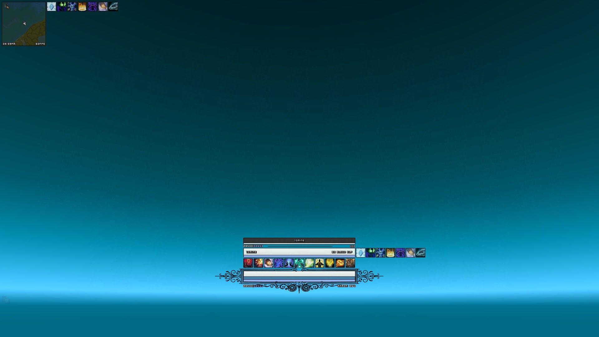 Party / Combat:  |
Its not perfect of complete.
 |
 |
Hi this is CeeUI 2.3.5 preview edition. I was inspired by Tomnie at very first.
You can find more info at my blog. http://vivianalive.wordpress.com/201...2-3-5-preview/ Resting – no target  Resting – targeted  In Combat – Team  |
Reborn ui got reborn.
First of many thanks too sycobob who made a fan update on the older reborn ui. 6 too 8hours a day for the past 7 days..    |
|
2 Attachment(s)
This has been in the works for some time. I haven't changed it in almost a month, so I must have done something right to make me want to stick with it!
|
2 Attachment(s)
Been playing with this for about a week, It's starting to grow on me.
First pic is unfinished (data feeds and ToT) but wanted to show raid frames, and second pic is a little more polished. |
1 Attachment(s)
Same ole' same ole' lol
|
Marujins Hunter Ui
http://i40.servimg.com/u/f40/16/00/20/10/wowscr42.jpg
its still in process i like it simple and clean some buttons are not visible as long i not hover over them. |
 Same as always.. |
murp..
solo  10m (out of combat)  |
 Something simple. Modified addons so they suit my needs. Screenshot isn't actually latest version since I have now a small EP/REP bar below my action bars.. since I am farming reputation currently. |
I'm not one of the minimalist people. Yes, I like it simplistic and stripped, in a way, but I still want my UI to look "robust", so to speak. This is where this inspiration has led me so far. What do you guys think? Speech is free :)
Something to note is the bossframes, they have been modified to no longer hold a portrait or a powerbar. They just look big and silly in this screenshot :p It may look cluttered, but I'm playing on a 1366x768 screen so it's hard to avoid :p   |
My UI
Home-made.
This is a old screenshot, the quest log is transparant now. I'm looking for a nice buff addon but can't seem to find one. Satrina Buff Frames isn't working for me. I'm using bBuff right now, it's quiet good but still not happy about the way it looks.  |
1 Attachment(s)
This is my current work in progress, I like the centre box idea behind it, but I'm not really happy with the minimap/skada position.
However, if I put it on the bottom right corner and make a panel for it, it's not going to look symmetric anymore because the chat doesn't have a panel, and I kind of wanted to avoid that. Any suggestions would be perfect. |
 |
A mix of my normal UI with Butger's GW 2 interface.
edit: out of combat "art" stuff at the bottom in black and class colored. https://dl.dropbox.com/u/2051073/WoW...312_190841.jpg in combat "art" stuff at the bottom in black and red (combat indicator). https://dl.dropbox.com/u/2051073/WoW...312_190901.jpg another in combat color for dk, since red to red would be a bit.. nonsense. http://dl.dropbox.com/u/2051073/WoWS...312_223843.jpg Maybe I'll change everything a bit more and such but.. at the moment I am quite satified. Simple and solid. :) |
Punishor - 85 Tauren Pally - Dragonblight
1 Attachment(s)
Check This Out Guys
|
|
|
This is my second and primary UI I am currently using. Its aim is to be very easy to use, graphically pleasing, well positioned and clean. I try to make it as uncluttered as possible without having to strain your eyes to see everything especially when in a hurry.
I've been working on this UI for many years now and for me its graphically pleasing and everything is well positioned with clever functionality to it such as being able to press the Expand and Retract button to add a new action bar row and move everything up to make room. You can also press the "D" or "H" button next to the chat box to quickly swap layouts from "Damage / Tank" to "Healer". I focused on making it easy and effective to use in the game by making sure that every UI element was kept at a good size to as not to strain your eyes while also making sure that the screen was not cluttered. And yes you can easily move the chat box and swap its art work to have it at the bottom left corner instead of top right! There are instructions on how to do this and much more. You can disable class colours and set the colours of the background frames to anything you want. This UI is fully customisable and comes with a very nice Set-up AddOn that contains a list of helpful tips so that you can read them for help directly in the game rather than having to minimize WoW to load up the internet. It is suitable for all classes, specs and roles and comes in 4 different Resolutions. It is very possible to configure it yourself for other resolutions as well but the below four are just the ones I've fixed it to work for so far: 1920x1080, 1680x1050, 1600x900 and 1440x900 Please help me by offering constructive criticism/feedback and recommending it to friends if you like it. Thank you! Screen Shots: Solo:   Setup Addon:  Chat Box in the Bottom Left Corner:  Tanking:  25 Player Healing:  Extra row of Action Bars at the Bottom:  There are many more screen shots available on the Information page... I hope you like it! Any feedback is greatly appreciated but before asking questions please check the home page for extra information as well as the F.A.Q's at the bottom since the question may have already been answered: Download Page with Information here! |
 I use X-Perl Unitframes, Dominos, Titan Panel, and Carbonite |
Back to the drawing board; I typically had things "oversized" because of the 2560x1600 resolution.
This looks awkward doesn't it? LOL. Before: The big black box at far right is where Omen and Recount show up; it's blank because well, I'm in Stormwind.  Solo:  Raid:  |
1 Attachment(s)
To add to the show.. my constantly evolving WIP from the past 2 years or so, lol. Serves me well for any and all roles.
|
1 Attachment(s)
Been a while since I've uploaded a worthwhile UI. Keeping it small, simple, and stream line this time around instead of my usual graphic intensive direction.
|
I post my UIs that are finished enough to be presentable here, along with addon lists. Here is a raid shot of the latest one:
 |
This is what I use, I'm pretty satisfied with it.
 |
Been playin my monk more lately. Using my wildheart UI with some changes.
 |
This is my Lui
Hello everyone!
This is my Lui.   Native resolution 2560x1600 Links below. http://postimg.org/image/s5731zacz/ http://postimg.org/image/was0740yv/ |
I managed to unbury some really old UI pics.
 I used to have a thing against the player frame at that point in time  kinda hard to imagine just how drastically different my UI is now  |
 |
Same as always..
 |
|
Hey guys here my UI during an encunter:
 |
|
 |
|
| All times are GMT -6. The time now is 09:43 AM. |
vBulletin © 2024, Jelsoft Enterprises Ltd
© 2004 - 2022 MMOUI


