Thread Tools Display Modes
11-06-07, 12:48 PM   #21
WaldoJeffers
A Molten Giant
 
WaldoJeffers's Avatar
Join Date: Jan 2007
Posts: 564
Im assuming Galinn would of just put the game menu bar on hide till mouse over as he uses bt3. Great UI Remove statuswindow ( or its position at least, it looks like its set up as a feature) Move SL Timex. And remove Trinket menu's cogwheel config button. Oh and fix fubar's look. Then a greater UI
__________________
I said lady, step inside my Hyundai
  Reply With Quote
11-06-07, 01:10 PM   #22
Galinn
A Chromatic Dragonspawn
AddOn Compiler - Click to view compilations
Join Date: Feb 2007
Posts: 154
Originally Posted by Seerah
You have those backwards, btw. Line 2802 sets up the texture for the titlebar of the frame, while line 2803 sets the background color for the frame.

@Galinn: I would suggest MicroMenuFu to replace the menu bar you removed. I know FuBar was last on your to-do list, but yes - hide until mouseover and get rid of any icons on it you don't need. BT3, cyCircled, etc. I, personally, never saw the need for MCPfu myself. I would also give SLTimex a gray background to balance out Violation and increase its readability. And move the questlog up higher to the corner - right now that's a gap of unused space right there (unless you have something else that goes there?)

edit: oh - and bump down the lower eePanels so they meet the bottom edge of your screen.
Ehmm yes buffalo is stationed there.. and i am looking into SLtimex for giving it a background its a good idea
  Reply With Quote
11-06-07, 01:22 PM   #23
alikstromblade
A Defias Bandit
Join Date: Jan 2005
Posts: 2
Don't have any experience in making a UI but this looks very nice.

What resolution are you at?

My main problem is I am partly blind and all the great UI's I find are for really high Res and I get horrible eye strain headaches if I play due to not being able to read all the data.

Great job though. I will give the finished product a try!
  Reply With Quote
11-06-07, 01:40 PM   #24
Galinn
A Chromatic Dragonspawn
AddOn Compiler - Click to view compilations
Join Date: Feb 2007
Posts: 154
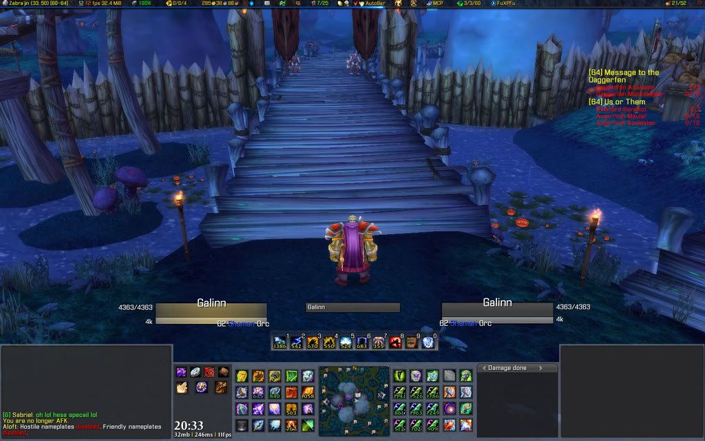
voila kicked statuswindow with the large empty space in my heart now lol

dragged autobar in ditched the trinketmenu icon put the micromenu on fadeout somewere on the UI en put up a small bagbar!


enjoy

@alikstromblade

i run at 1440 x 900 wide screen m8

Last edited by Galinn : 11-06-07 at 01:54 PM.
  Reply With Quote
11-06-07, 01:40 PM   #25
Cralor
Mmm... cookies!!!
 
Cralor's Avatar
AddOn Author - Click to view addons
Join Date: Jun 2007
Posts: 772
Yea.

Most of the things can be configured Font Size wise, but stuff like the Friends list and stuff can't if you already have the UI Scale set to '1'.
__________________
Never be satisfied with satisfactory.
  Reply With Quote
11-06-07, 02:16 PM   #26
Galinn
A Chromatic Dragonspawn
AddOn Compiler - Click to view compilations
Join Date: Feb 2007
Posts: 154
just got a horrible empty space above my SLtimex window..

dont have anything 2 fill it up i am empty on idea's any of u guys got a good idea??
  Reply With Quote
11-06-07, 03:09 PM   #27
Taffu
A Flamescale Wyrmkin
AddOn Author - Click to view addons
Join Date: Jan 2006
Posts: 149
SLTimex 2.0 is going to be released very soon, and it's got a much more customizable approach to layout, along with a lot of extra modules that will make cleaning up FuBar bars (and even hiding them) much easier. You'll be able to fill that area with the new modules that will be included with the addon. Check out the forum thread about it to get an idea (via included pic) as to what you'll be able to do with it.

Good job...looks nice and clean. A little "big" for me, but clean and organized...very "Mazzle"-esque.
  Reply With Quote
11-07-07, 03:07 AM   #28
Galinn
A Chromatic Dragonspawn
AddOn Compiler - Click to view compilations
Join Date: Feb 2007
Posts: 154
Took a peak at SLtimex 2.0 and i am very exited about it! and i am looking forward of using it in my UI!
Got a question tho.. what do you mean with 2 big?? you mean buttons or scale or something else??

:update:

Well i finally think my solo look is done! i am busy with the group look now and its not much work almost done! its nothing special not putting up Party's target etc etc etc it would fill the screen up way 2 much!
And for the raid layout i was thinking of using Perfectraid for that what do you guys think??

Grtz
  Reply With Quote
11-07-07, 04:26 AM   #29
Galinn
A Chromatic Dragonspawn
AddOn Compiler - Click to view compilations
Join Date: Feb 2007
Posts: 154
update coming, got a problem cant figure it out anymore


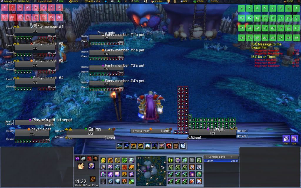
my problem is the party pets.. in the default look of Wow.. the pets are stationed right underneath the players.. in party look.. but now with pitbull it are 2 complete different modules.. i cant find a good spot 2 put them down plz help!!

greetz
  Reply With Quote
11-07-07, 06:52 AM   #30
Icecoldcoke
A Flamescale Wyrmkin
AddOn Author - Click to view addons
Join Date: Sep 2007
Posts: 132
Originally Posted by Galinn
update coming, got a problem cant figure it out anymore


my problem is the party pets.. in the default look of Wow.. the pets are stationed right underneath the players.. in party look.. but now with pitbull it are 2 complete different modules.. i cant find a good spot 2 put them down plz help!!

greetz
Don't show party pets, hunters can heal their own pets, a long with locks, and it takes up a lot of space :P
  Reply With Quote
11-07-07, 07:08 AM   #31
Taffu
A Flamescale Wyrmkin
AddOn Author - Click to view addons
Join Date: Jan 2006
Posts: 149
Originally Posted by Galinn
what do you mean with 2 big?? you mean buttons or scale or something else??
Not a bad thing, it's just personal preference. I'm more of a minimalist, so I like very little of my screen space to be taken up.
  Reply With Quote
11-07-07, 07:10 AM   #32
ReverendD
A Rage Talon Dragon Guard
 
ReverendD's Avatar
AddOn Author - Click to view addons
Join Date: Sep 2006
Posts: 343
If you really want party pets (i like party pets and party targets), just make them small. I remove all buff info from them and all their Icons except raid. Here is how I set mine up so I can see everything.

Party pets are under each party member to the right. Party targets are to the left and slightly out past the party member.
Attached Images
File Type: jpg WoWScrnShot_110707_080258.jpg (243.2 KB, 123 views)
  Reply With Quote
11-07-07, 10:03 AM   #33
Seerah
Fishing Trainer
 
Seerah's Avatar
WoWInterface Super Mod
Featured
Join Date: Oct 2006
Posts: 10,860
Yeah, I think you would be better served to make both your party frames and party pets smaller. Play with your PitBull options - you can do most anything. Also, you can set spacing for those frames, so that you can place pets in between.

edit: here are more examples on how you can make your party display look. In the first screenshot, party is laid out horizontally, with party pets at the bottom left of their owners and party targets at the bottom right. Second screenshot, party is laid out vertically, with party targets to the right of the frame and party pets below targets.
Attached Images
File Type: jpg WoWScrnShot_082907_215044.jpg (261.1 KB, 169 views)
File Type: jpg WoWScrnShot_062407_175110.jpg (262.7 KB, 112 views)
__________________
"You'd be surprised how many people violate this simple principle every day of their lives and try to fit square pegs into round holes, ignoring the clear reality that Things Are As They Are." -Benjamin Hoff, The Tao of Pooh


Last edited by Seerah : 11-07-07 at 10:10 AM.
  Reply With Quote
11-07-07, 10:20 AM   #34
Galinn
A Chromatic Dragonspawn
AddOn Compiler - Click to view compilations
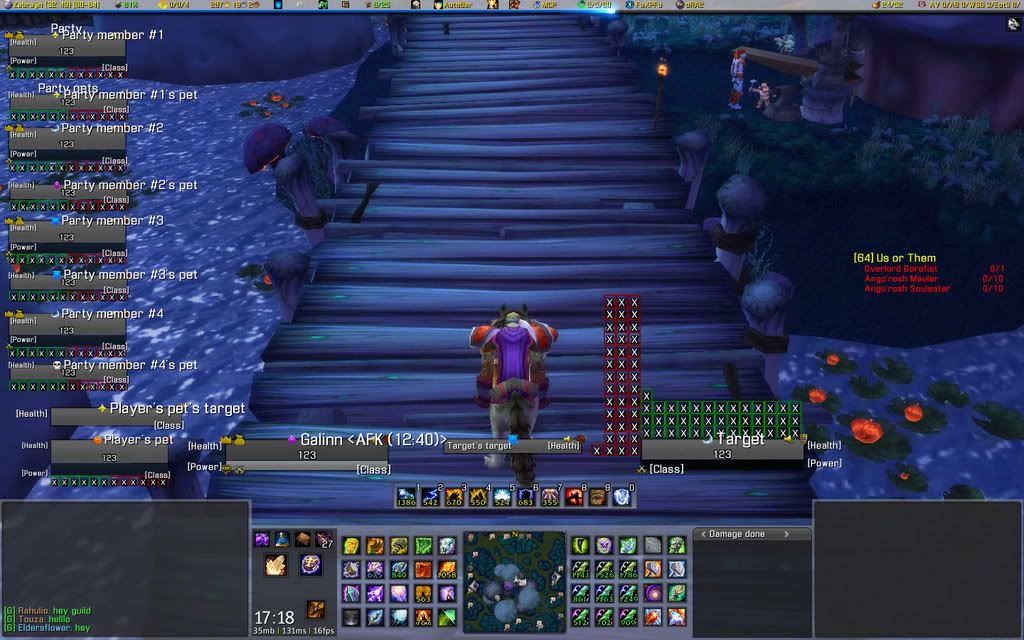
Join Date: Feb 2007
Posts: 154
Voila


this is what i got so far.. i can change it ofc.. leave a comment guys need ur guidance

greetz
  Reply With Quote
11-07-07, 10:58 AM   #35
Zyonin
Coffee powered Kaldorei
 
Zyonin's Avatar
AddOn Author - Click to view addons
Join Date: May 2006
Posts: 1,443
Not bad, if you are going to use the Pet's Target frame (something I never use) you should at least make it the same size as the Target of Target frame.
__________________
Twitter
  Reply With Quote
11-07-07, 11:06 AM   #36
Seerah
Fishing Trainer
 
Seerah's Avatar
WoWInterface Super Mod
Featured
Join Date: Oct 2006
Posts: 10,860
I still don't think you need things as large and as spread out as that. (party, party pet, etc)
__________________
"You'd be surprised how many people violate this simple principle every day of their lives and try to fit square pegs into round holes, ignoring the clear reality that Things Are As They Are." -Benjamin Hoff, The Tao of Pooh

  Reply With Quote
11-07-07, 11:23 AM   #37
ReverendD
A Rage Talon Dragon Guard
 
ReverendD's Avatar
AddOn Author - Click to view addons
Join Date: Sep 2006
Posts: 343
Originally Posted by Seerah
I still don't think you need things as large and as spread out as that. (party, party pet, etc)
I agree with Seerah. In a party that has pets, healers normally only focus on the players, pets only get healed/cleansed if the extra mana is available since the pet owners can take care of their own pets or request buffs/cleansing between fights. Its good to be able to see their info, but imo unless you are a healer you really only need to see their health at most. Anything else (energy/buffs/etc) will only be a concern of the owner of the pet.

As for targets of party members and whatnot, unless your really hardcore to achieve the 6 degree's of Kevin Bacon in your target setup, anything beyond your focus target and a party target I think gets to be too much. Its helpful to have a focus target and party target in large encounters, but pet targets, and ToT, ToTT, and ToKB (KB=Kevin Bacon) can really add up to a lot of clutter and confusion.

This is of course my opinion and you may use what you like of it. Overall I like the look of your UI, it seems smooth to me and everything seems to be in an easy to reach area. Only other thing I would recommend is making the Fu_Bar background transparent. I do this only to make it look like the space is open, thus you don't get the feeling that you are locked into a given space.
  Reply With Quote
11-07-07, 12:12 PM   #38
Galinn
A Chromatic Dragonspawn
AddOn Compiler - Click to view compilations
Join Date: Feb 2007
Posts: 154
no i am not that hardcore 2 use party's target, thats op to the player 2 add for himself the day that this UI comes out!

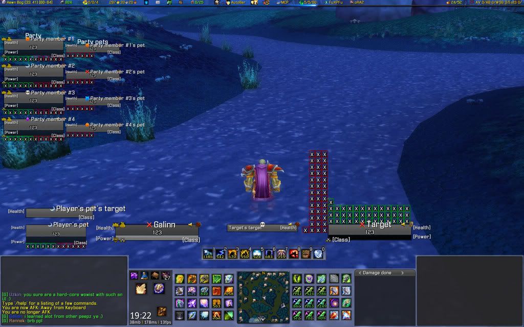
i am gonna scale the part plus the party pets cause they are indeed 2 large! and i will make the fubar transparent cuz i kinda feel closed in atm.. just wanted 2 try and how it would look!

thx for all the comments guys!
  Reply With Quote
11-07-07, 12:25 PM   #39
Galinn
A Chromatic Dragonspawn
AddOn Compiler - Click to view compilations
Join Date: Feb 2007
Posts: 154
voila transparent fubar

and....


  Reply With Quote
11-07-07, 01:20 PM   #40
Slakah
A Molten Giant
 
Slakah's Avatar
AddOn Author - Click to view addons
Join Date: Aug 2007
Posts: 863
Originally Posted by Galinn
voila transparent fubar

and....
I would still make the fubar shorter.
  Reply With Quote

WoWInterface » AddOns, Compilations, Macros » Alpha/Beta AddOns and Compilations » Galinn's UI first glimpse


Posting Rules
You may not post new threads
You may not post replies
You may not post attachments
You may not edit your posts

vB code is On
Smilies are On
[IMG] code is On
HTML code is Off